Nobody remodels a kitchen for fun. You do it because the drawer sticks, the counter is too small for two people to chop at once, and the light over the sink makes everyone look tired. Then you spend weeks washing dishes in the bathtub and eating takeout on the sofa. 🥡
So every choice has to earn its place. These kitchen remodel ideas are the upgrades I’d happily live through the dust for: walls that come down, windows that grow, floors that last for decades and lighting that finally works at 6 p.m. in November.
Some are big structural moves. Some are surface swaps you can finish in a long weekend with the right crew. All of them change how the room feels every single day.
Knock Down the Wall Between the Kitchen and Dining Room
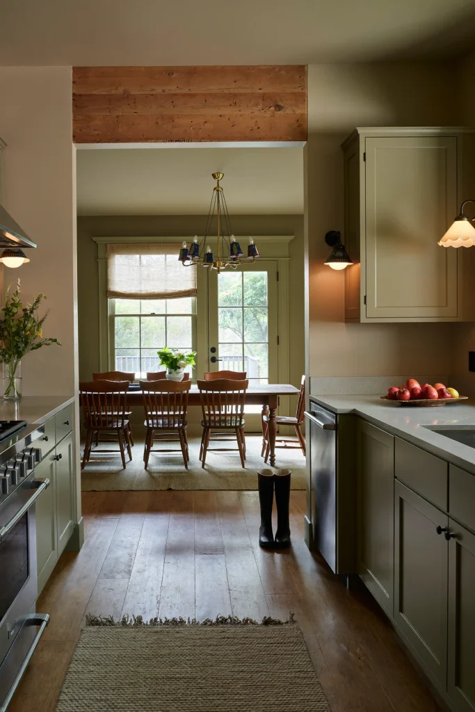
If your kitchen feels like a closet with a stove, look at the wall next to it. Taking out the wall between the kitchen and dining room is the single remodel that changes the most. Light from two rooms meets. Whoever’s cooking can actually talk to everyone at the table.
Most of these walls hold something up, so you’ll often see a flush beam or a slim header left behind. Don’t fight it. Wrap it in wood or paint it the ceiling color and it reads as architecture, not a compromise.
Ask Your Contractor This
- Is this wall load-bearing, and will we need an engineer?
- Are there pipes, ducts or wiring inside it?
- Can the beam sit flush in the ceiling instead of hanging below it?
- How will you patch the floor where the wall used to stand?
Add a Furniture-Style Island With Turned Legs
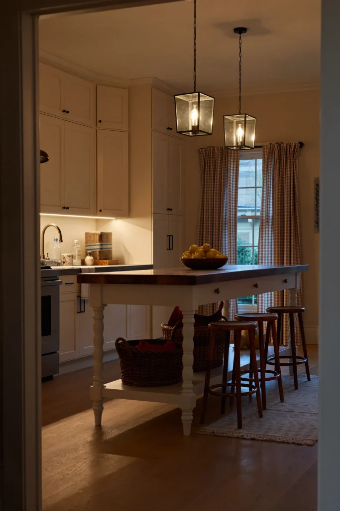
A boxy island can make a traditional kitchen feel like a new-build. Give it legs instead. A furniture-style island with turned legs, an open shelf underneath and a thick wood or stone top looks like it was carried in from an old farmhouse dining room.
It’s a great fit for older homes where a solid slab would feel too heavy. You still get storage and a prep surface, but the floor runs underneath, so the room looks bigger. Paint the base a soft contrast color and keep the top warm. Two or three stools tucked under one end, and breakfast has a home. ☕
Enlarge the Window Over the Sink
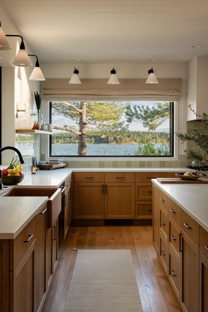
The sink is where you stand the most, so give it the best view in the house. Widening that window, or dropping the sill closer to the counter, floods the whole kitchen with light and makes washing up feel a lot less like a chore.
Ask about a casement or a big fixed pane flanked by two that open. Then run the backsplash material right up to the window frame so it feels intentional. A simple linen Roman shade keeps the glare down on bright afternoons without blocking the view you just paid for. 🌤️
Build a Plaster Range Hood
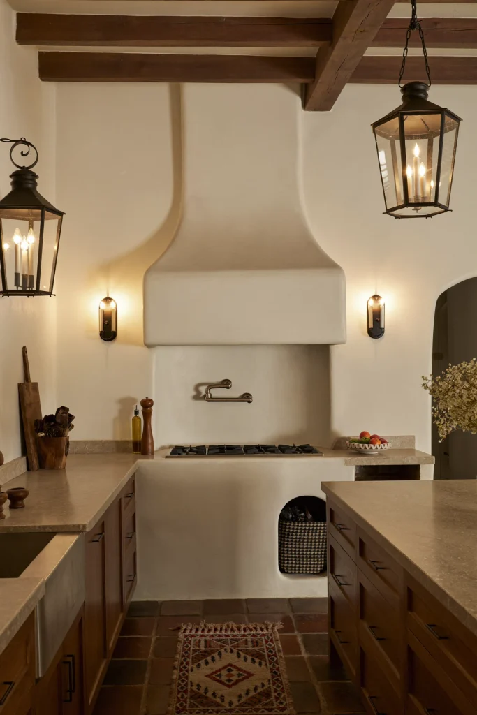
A stainless hood does the job. A plaster hood becomes the heart of the room. Built around a standard insert, a smooth plaster hood curves or tapers up to the ceiling and gives your stove wall the presence of an old fireplace.
It suits Mediterranean-inspired kitchens beautifully, but it works in plain white Scandinavian rooms too. Limewash or a tinted plaster finish adds soft movement that paint can’t match. Pair it with a small ledge at the base for salt and olive oil, and you’ve got a working wall that also looks like a sculpture.
Cost Breakdown
| Item | Typical range |
|---|---|
| Hood insert (fan and filters) | around 400 to 1,500 dollars |
| Framing and drywall shell | around 500 to 1,200 dollars |
| Plaster or limewash finish | around 600 to 2,000 dollars |
| Ducting to the outside | around 300 to 900 dollars |
Run a Zellige Tile Backsplash All the Way to the Ceiling
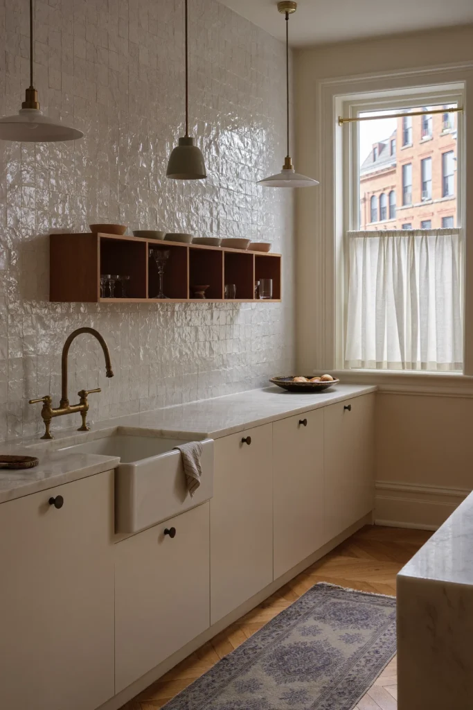
Stopping a backsplash at the bottom of the upper cabinets is fine. Running it all the way up is unforgettable. Handmade zellige tiles, with their wobbly edges and glossy, uneven glaze, bounce light around in a way flat subway tile never will.
Go floor-to-ceiling on one wall only, usually the sink or range wall. Choose a soft color like milky white, pale sage or warm clay so the texture does the talking. Grout in a close match keeps it calm. It costs more per square foot, but you only need one wall to change the mood of the whole kitchen. ✨
Swap Laminate for Honed Marble Countertops
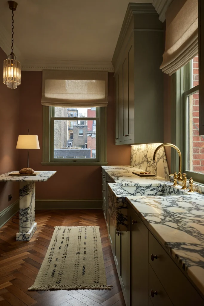
Here’s the countertop upgrade I’d choose for an older home. Honed marble has a soft, matte surface that feels like stone should. It looks like it’s been there for a hundred years on the first day.
Yes, it etches. Lemon juice and red wine will leave marks. But honed marble hides those marks far better than polished, and over time they blend into a gentle patina that most people end up loving. Pick a slab with quiet veining and a thicker edge profile for a classic look.
Myth-Buster
“Marble is too fragile for a family kitchen.” It’s softer than quartz, but it won’t crack from daily use. The real trade-off is patina, not durability. If you can live with a few etch marks, it will outlast you.
Build a Walk-In Pantry Behind a Hidden Door
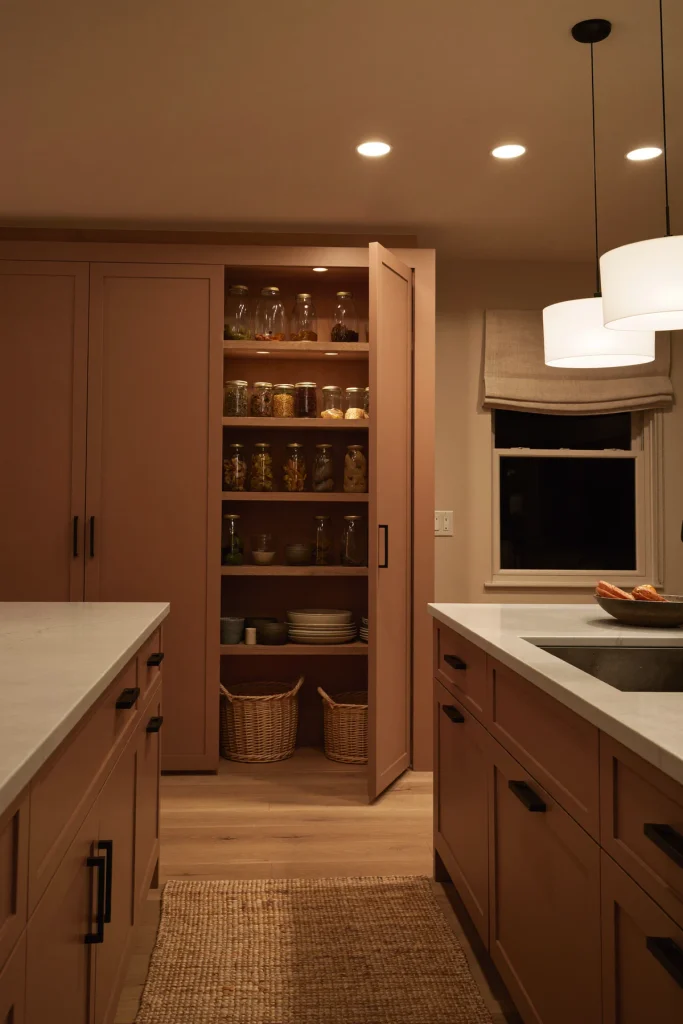
The best pantries are the ones nobody can see. Steal a few feet from a hallway, a mudroom or the end of the kitchen and build a walk-in pantry behind a door that matches the cabinetry. Closed, it looks like a tall cupboard. Open, it holds everything.
Inside, keep it simple: deep shelves on three sides, a counter at waist height for the toaster and mixer, and a light that switches on with the door. Suddenly your main counters are clear and stay that way.
Checklist
- At least 4 feet of depth so two people can turn around
- Shelves 12–16 inches deep (deeper ones swallow things)
- An outlet at counter height
- Touch-latch or concealed hinges on the door
- A light on a door switch or motion sensor
Expose the Ceiling Beams
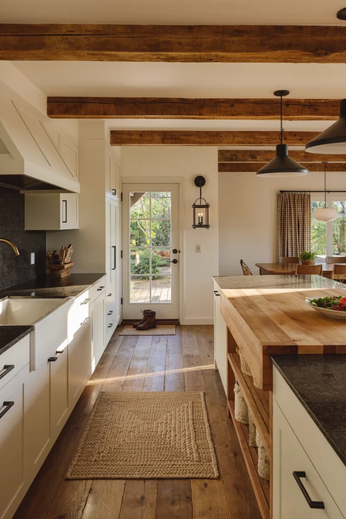
Sometimes the best remodel is hiding above your head. Older farmhouses and cottages often have real timber beams covered by drywall. Opening the ceiling to show them adds height, warmth and instant age.
No original beams? Reclaimed or hand-hewn box beams can be added to most flat ceilings. Space them evenly and run them across the shorter width of the room so the kitchen feels wider. A white or pale plaster ceiling between them keeps everything bright. Hang the island pendants from the beams themselves and the whole room looks planned from day one. 🪵
Reface Your Cabinets Instead of Replacing Them
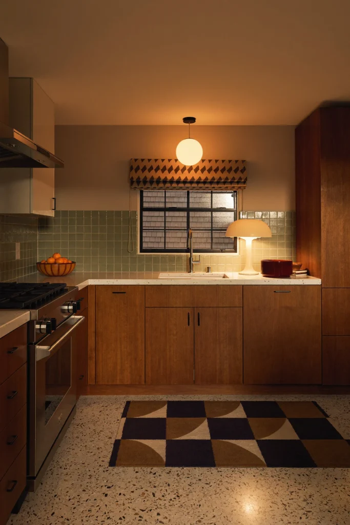
If your cabinet boxes are solid and the layout works, you don’t need to rip them out. Refacing means keeping the boxes and replacing only the doors, drawer fronts and side panels. It’s faster, less messy, and the money you save can go toward counters or lighting.
This is where a dated ranch kitchen can turn mid-century-inspired in a week. Swap raised-panel oak doors for flat walnut slabs or simple Shaker fronts. Add new hinges with soft-close, run integrated finger pulls or slim brass knobs, and suddenly nobody can tell the boxes are thirty years old.
Budget Alternatives
- Refacing: often around half the cost of full replacement
- Paint the boxes and order new doors only from an online door maker
- Keep the lowers, replace only the uppers with open shelves or glass fronts
Panel the Fridge So It Disappears Into the Cabinetry
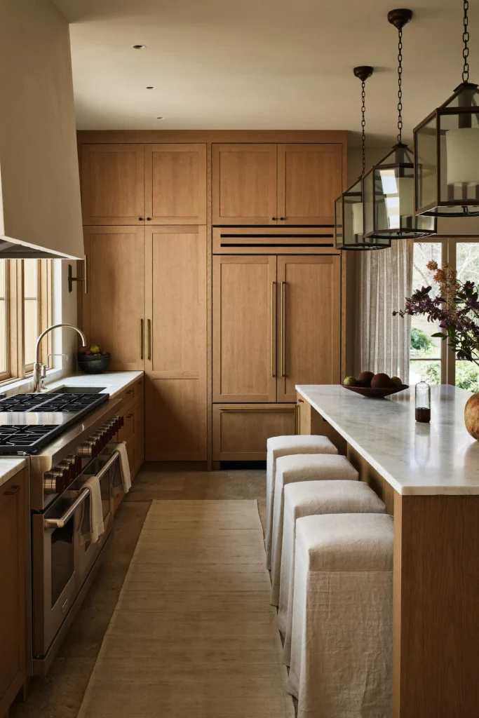
The fridge is the biggest box in the kitchen and usually the ugliest. A panel-ready refrigerator takes a cabinet front that matches everything else, so it vanishes into a calm wall of doors.
Plan a full “appliance wall”: fridge, freezer column, wall oven and a pantry cabinet lined up floor to ceiling. Keep the handles consistent across all of them. From the dining table you see one beautiful piece of joinery instead of a row of mismatched appliances.
It costs more up front, since panel-ready models and extra cabinetry add up. But if you hate visual clutter, this is the upgrade you’ll appreciate every single morning. Remember the hidden pantry door from idea 8? Use the same panel style here and the whole wall reads as one.
Turn a Galley Into an L-Shape With a Peninsula
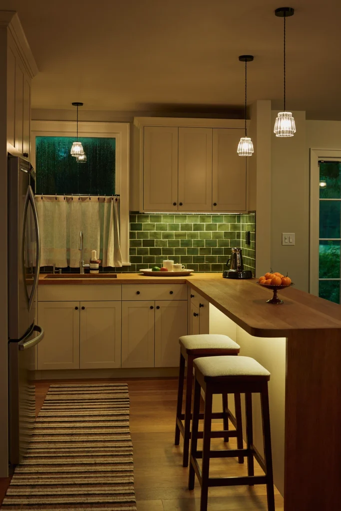
Long, narrow galley kitchens are efficient but lonely. If one side backs onto a living area or hallway, you can often remove the upper cabinets on that side, shorten the run and finish it with a peninsula. Now the galley becomes an L, and the end of it becomes a spot for stools.
This works especially well in row houses, where the kitchen is usually tucked at the back. The peninsula gives you extra counter space, a place for homework, and a natural barrier that keeps everyone out of the cook’s way without shutting them out.
Rule of Thumb

Leave at least 42 inches between the peninsula and the opposite counter, and 48 inches if two people often cook together. Allow about 24 inches of counter width per stool.
Add a Waterfall-Edge Quartzite Island
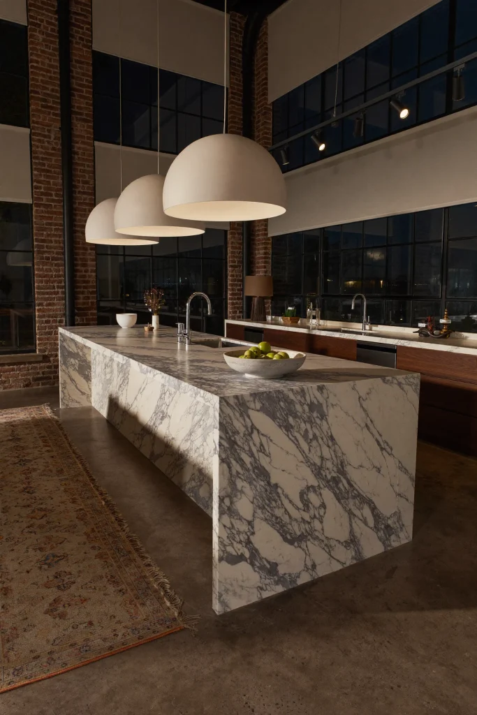
A waterfall island is when the countertop slab doesn’t stop at the edge but runs straight down to the floor on both ends. In a big loft with high ceilings and plenty of concrete and brick, it gives the room a confident centerpiece.
Quartzite is my pick here. It’s harder than marble, handles heat better than quartz, and its natural veining looks dramatic when it flows down the sides. Ask your fabricator to book-match the vein so the pattern wraps around the corner without a jump. Then keep everything else quieter, because this island is the star. 💎
Pro Tip
Go to the stone yard yourself and pick the exact slab. Mark where you want the waterfall cut so the most beautiful part of the vein lands on the end people see first.
Replace a Back Wall With Steel-Framed Glass Doors
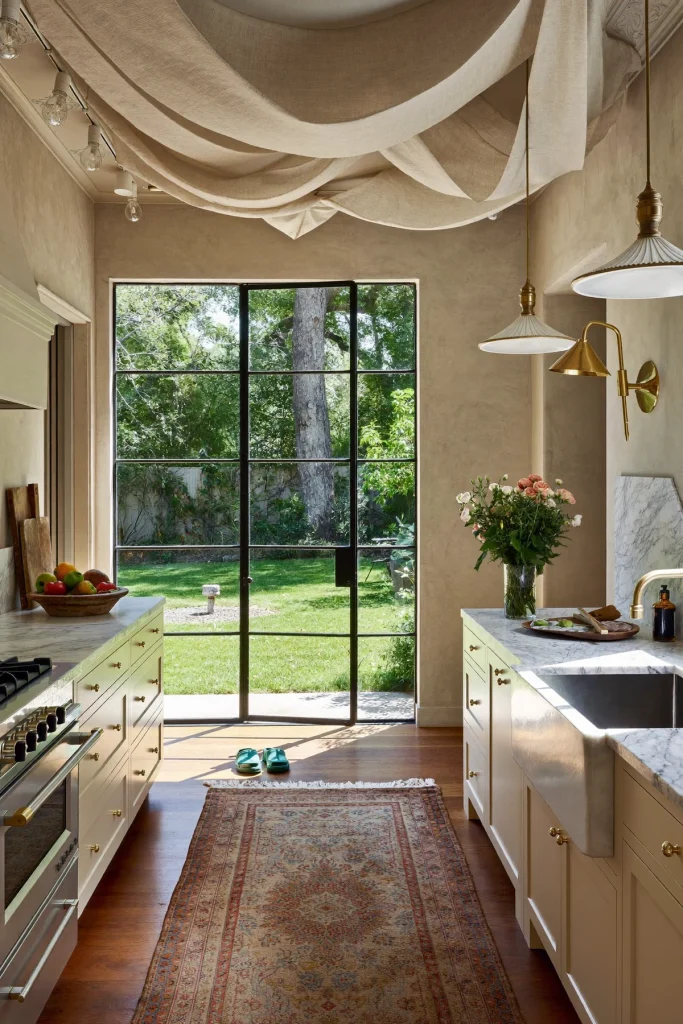
If your kitchen sits at the back of the house, the back wall is probably your biggest missed opportunity. Swapping a small window and a single door for a run of black steel-framed glass doors connects the kitchen to the garden and lets light pour in all day.
Steel-look aluminum is a good, more affordable option with the same slim lines. Choose a style with divided panes in an old Victorian or Tudor house, and plain large panes in a newer one.
Hang lightweight linen panels on a ceiling track so you can soften the glass at night. Summer dinners will start drifting outside without anyone planning it. 🌱
Lay Checkerboard Stone Floors
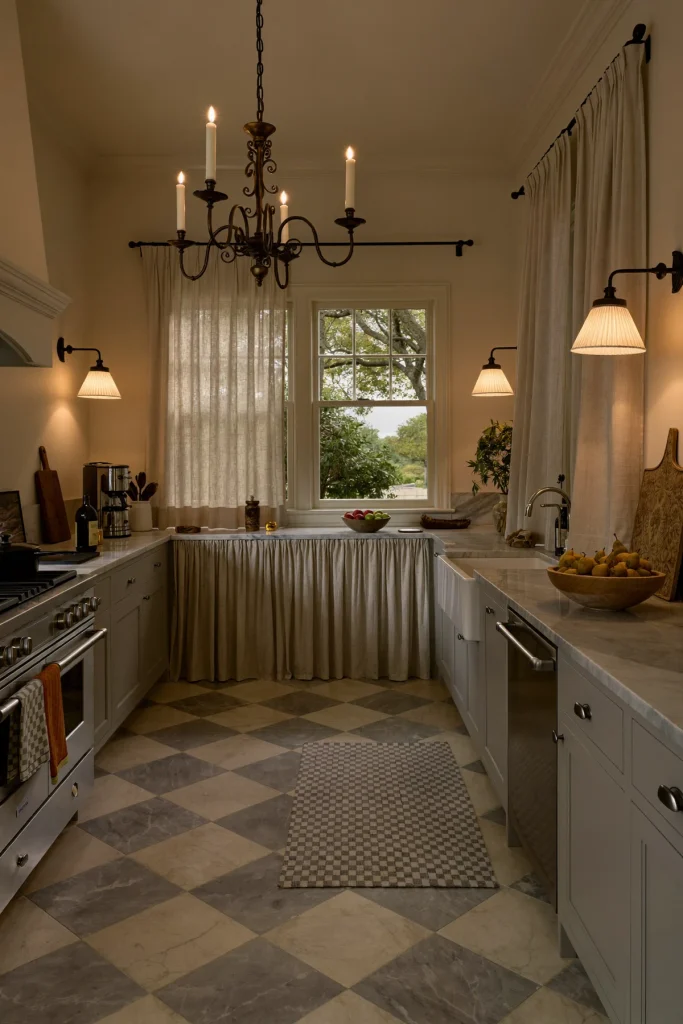
Checkerboard floors look old-world and fresh at the same time. In a French-country-inspired kitchen, a diagonal pattern of cream limestone and soft grey stone feels like it came straight from an old manor, but it works with today’s cabinets too.
Skip high-contrast black and white if you want a calm room. Low-contrast pairs like oat and taupe, or cream and pale green, are easier to live with and hide crumbs far better. Use a honed finish so the floor isn’t slippery when wet, and seal it well. Stone stays cool underfoot, so radiant heating underneath is a lovely bonus if the budget stretches.
Kid- and Pet-Proof It
Pick tiles with some natural variation so muddy paw prints and spilled juice blend in. Choose a mid-tone grout, never bright white, and reseal once a year. A washable runner in front of the sink catches the worst of it.
Build a Banquette Into a Bay Window
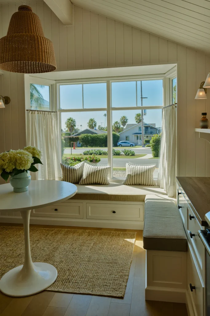
A bay window in a kitchen is begging for a built-in seat. Build a banquette that follows the shape of the bay, with deep drawers underneath and a cushion on top, and add a round pedestal table in front. You’ve just made the coziest seat in the house.
No bay window? Bump out a small one during the remodel. Even a shallow bay of 18–24 inches is enough for a seat. Plan it at the same time as the cabinets so the wood and paint match. Kids do homework there, guests perch there during dinner prep, and you’ll drink your morning coffee there more often than at the island.
Do This 👉 / Not This ❌
- 👉 Drawers under the seat. ❌ Lift-up lids nobody opens.
- 👉 A pedestal table so legs don’t knock knees. ❌ A four-legged table that traps people.
- 👉 Seat height around 18 inches. ❌ A seat so low your chin meets the table.
Add a Second Sink to the Island
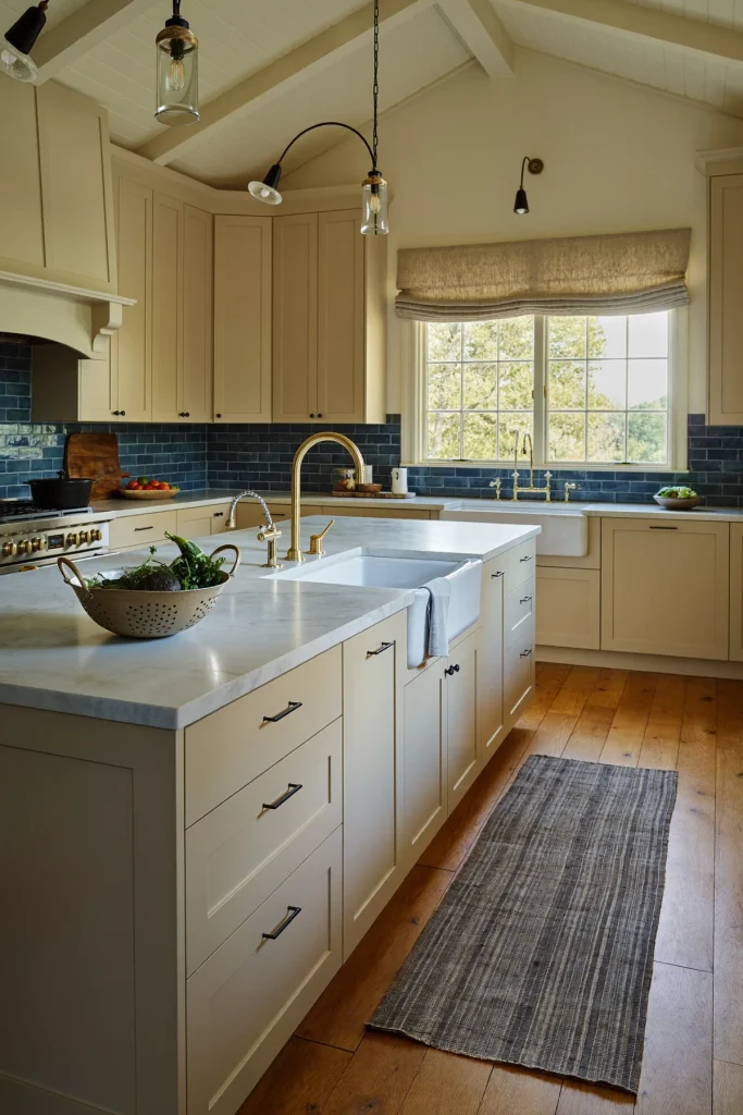
If two people cook in your house, two sinks are a gift. Put the main sink and dishwasher under the window, then add a smaller prep sink in the island. One person washes vegetables while the other cleans up, and nobody bumps elbows.
A prep sink can be small, around 15–18 inches wide, so it doesn’t eat up your island. Place it toward one end, leaving a long, clear stretch for chopping and rolling dough. Choose a matching faucet finish to the main sink for a pulled-together look.
Plumbing is the main cost here, since water and drains need to reach the island through the floor. That’s much easier if you’re already replacing the flooring. In a big family home with a generous island, this extra sink earns its keep every single day.
Trade Upper Cabinets for a Wall of Windows
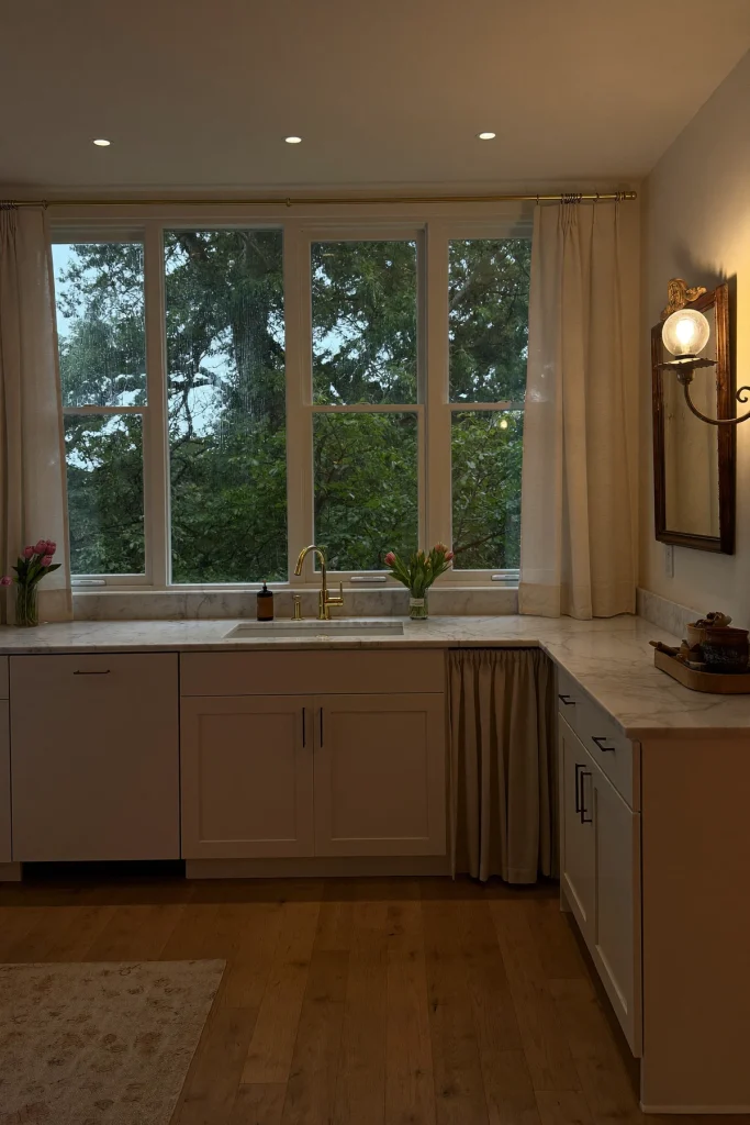
This one takes nerve. Remove the upper cabinets on one wall and replace them with a long run of windows above the counter. The kitchen goes from closed-in to bright and airy, and you get a view while you work.
You’ll lose storage, so plan for it. Deeper drawers below, a tall pantry cabinet elsewhere, or the walk-in pantry from idea 8 can all make up the difference. Keep the window sill a few inches above the counter so you can still have a short backsplash behind the faucet.
Dress the windows with café curtains on a slim rod across the lower half for privacy and softness. On a grey, rainy afternoon, this wall turns the counter into the best seat in the house.
What Most People Get Wrong

They forget where the outlets go. With no upper cabinets, there's no under-cabinet space to hide plugs. Ask for plug strips under the window sill or pop-up outlets in the counter so you're not running cords across the glass.
Pour Terrazzo Floors for a Playful Twist
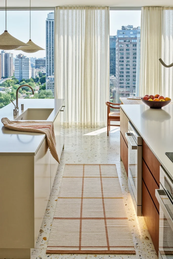
Terrazzo is having a big comeback, and for good reason. It’s tough, easy to clean, and comes in color combinations that range from soft and speckled to bold and confetti-like. In a high-rise apartment kitchen, it adds personality without a single extra object on the counter.
You can choose poured terrazzo for one continuous surface or large terrazzo tiles, which are faster to install and easier on the budget. Pick chips that pull colors from your cabinets or backsplash so the floor ties the whole room together.
A pale base with chips of sage, rust and cream feels fresh and happy without being loud. Keep everything else simple, like flat-front cabinets and plain counters, and let the floor do the talking. 🎨
Pour Concrete Countertops and Plaster the Walls
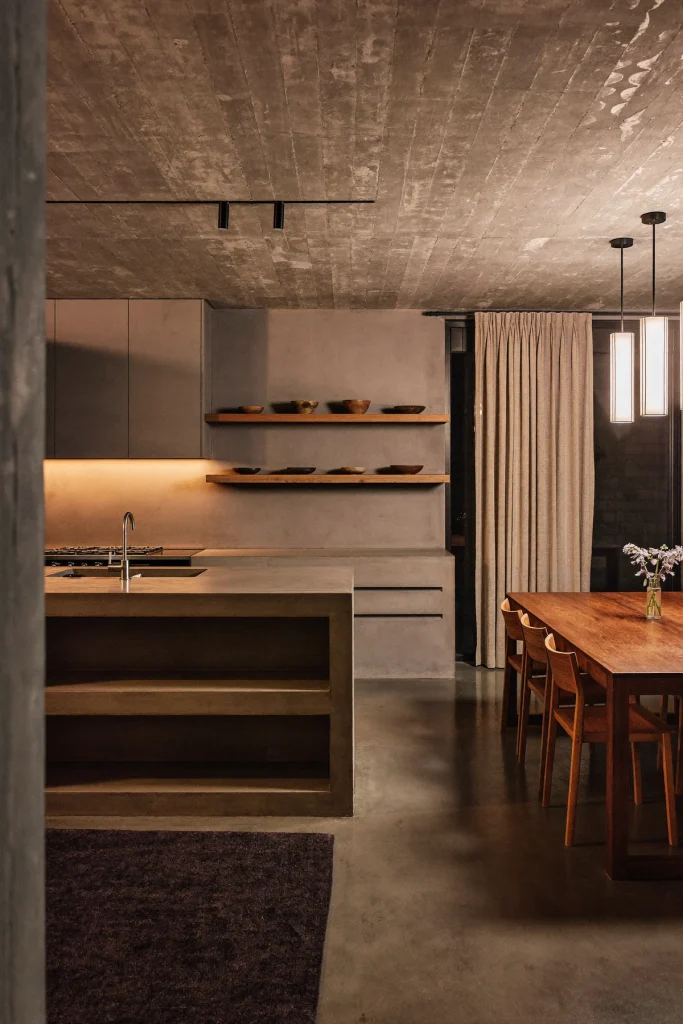
For anyone who loves a bold, architectural look, a concrete kitchen is a striking choice. Pour counters and an island in smooth grey concrete, then finish the walls in a matching mineral plaster. The whole room becomes one quiet, sculptural material.
It’s brutalist in spirit, but it doesn’t have to feel cold. Add warmth with wood: oak open shelves, a walnut dining table or a timber ceiling. Warm under-cabinet light and a few pendants keep it glowing in the evening instead of looking like a parking garage.
Concrete needs sealing and will develop small hairline marks over time. Most people who choose it like that honest, lived-in look.
The Live-With-It Test
Before you commit to a bold material, ask for a sample board and keep it on your counter for two weeks. Spill coffee on it. Set a hot mug on it. Look at it at night. If you still love it after fourteen days, you’ll love it in ten years.
Install a Book-Matched Marble Slab Backsplash
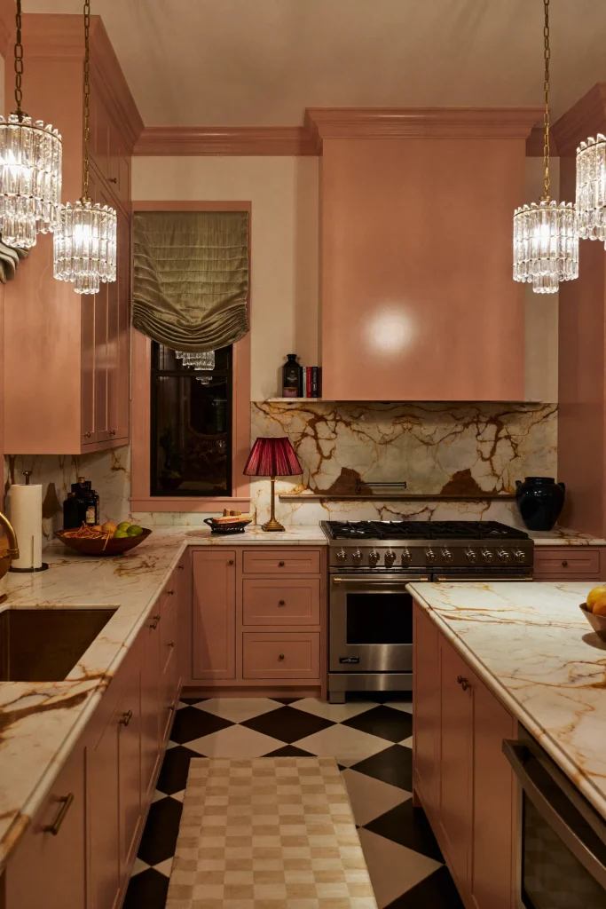
A slab backsplash is one continuous sheet of stone behind the range or sink, with no grout lines at all. Book-matching means two slabs are cut from the same block and opened like the pages of a book, so the veining mirrors itself in the middle.
The effect is pure drama, a little bit Hollywood Regency. Pair a bold marble, like one with deep green or gold veining, with glossy lacquered cabinets in a soft color and brass hardware. Add a small marble shelf along the top of the slab for a single lamp or a vase.
Slabs are pricey, so use them on one wall only. Since the counter can be made from the same stone, ask your fabricator to cut everything from matching slabs. Light it with a picture light or a sconce above and the stone glows at night. 💫
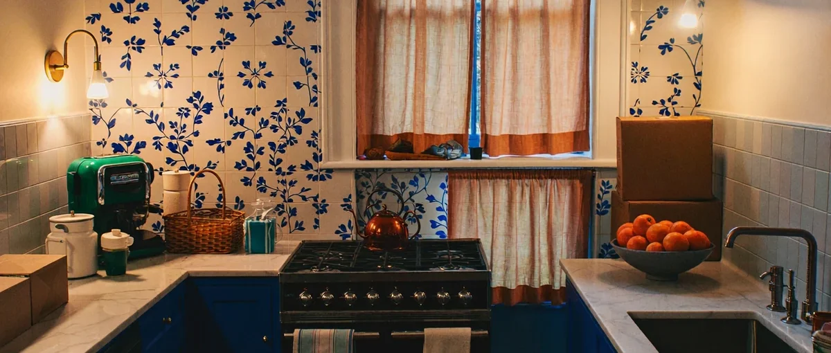
Cover the Walls in Hand-Painted Tile
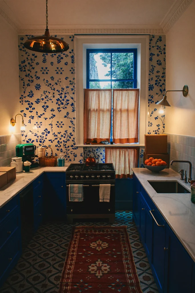
Maximalists, this one’s for you. Hand-painted tile, in blue-and-white Delft style, botanical patterns or colorful folk motifs, can cover an entire wall or even the whole kitchen. It turns a practical room into the most personal space in the house.
The trick is to choose one pattern family and stick with it. Mix a busy patterned tile with a plain tile in one of its colors so your eyes get a rest. Run patterned tile behind the range and around the window, and use the solid tile on the remaining walls.
Keep cabinets in a color pulled from the tile, and choose simple counters. In a Brooklyn brownstone with tall windows, a full tiled kitchen feels like it’s been loved for generations. It’s the kind of room you’ll never get bored of.
Frame the Kitchen Entry With a Plaster Arch
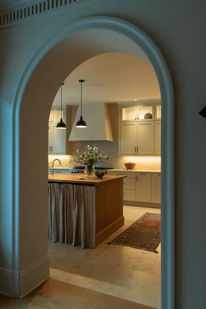
Sometimes the most beautiful remodel isn’t inside the kitchen at all. It’s the doorway. Replacing a square opening with a soft plaster arch makes walking into the kitchen feel special, and it frames the room like a picture.
Arches feel European and warm, especially when finished in limewash with rounded edges. They’re lovely in older homes, but they suit newer suburban houses too, adding the kind of character builders rarely include.
If you’re already moving walls, like in idea 1, ask about an arched opening instead of a square one. It costs a little more in framing and plaster, but it changes the whole feel of the space. Stand back at dusk, with the pendants on and the kitchen glowing through the arch, and you’ll know it was worth it. 🏡
The Dust Settles, the Kitchen Stays
A remodel feels endless while you’re in it. The noise, the dust, the dishes in the bathtub. Then one evening you flip on the new lights, lean on a counter that actually fits your life, and it all fades away.
You don’t need all Twenty two of these. Pick the two or three that fix what bugs you most: more light, more storage, a better place to sit. Spend where you touch and look every day, and save where you don’t.
Then pour yourself something nice, sit at that new island and enjoy the room you waited for. 🥰
