
If you’ve ever stood in the paint aisle staring at 200 shades of “beige,” I get it. It’s overwhelming.
Warm neutrals sound simple. But the difference between creamy-cozy and muddy-flat? Huge.
So I pulled together my 24 best warm neutral paint colors ideas — the kind that actually work in real homes. Not just perfectly lit Pinterest rooms. Whether you love soft taupe, creamy white, or earthy greige, there’s something here you’ll want to try. Let’s get into it. 🎨✨
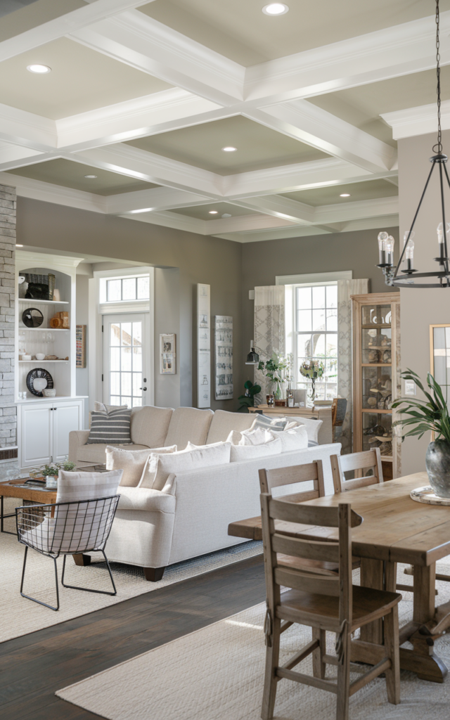
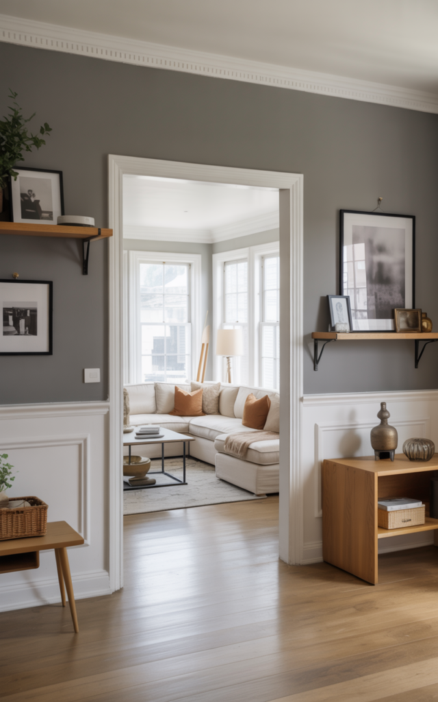
Paint your living room in Accessible Beige

If I had to recommend one safe-but-gorgeous warm neutral, this would be it.
It’s not too tan. Not too gray. It sits right in that sweet, cozy middle. In natural light, it feels creamy and soft. At night? Calm and grounded.
I especially love it with white trim and medium wood floors. It instantly makes a space feel pulled together without trying too hard.
Why it works?
Because it adapts. It warms up cool light and softens harsh light. Basically, it behaves.
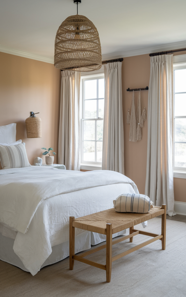
Soften a bedroom with Swiss Coffee

If you want warmth without visible “color,” this is your girl.
Swiss Coffee is creamy, subtle, and perfect for bedrooms where you want that hotel-soft vibe. Think fluffy bedding, layered throws, and warm bedside lamps. 🛏️
It doesn’t feel stark like bright white. Instead, it wraps the room in a quiet glow.
Quick Tip: Use warm light bulbs. Cool lighting will cancel the cozy effect.
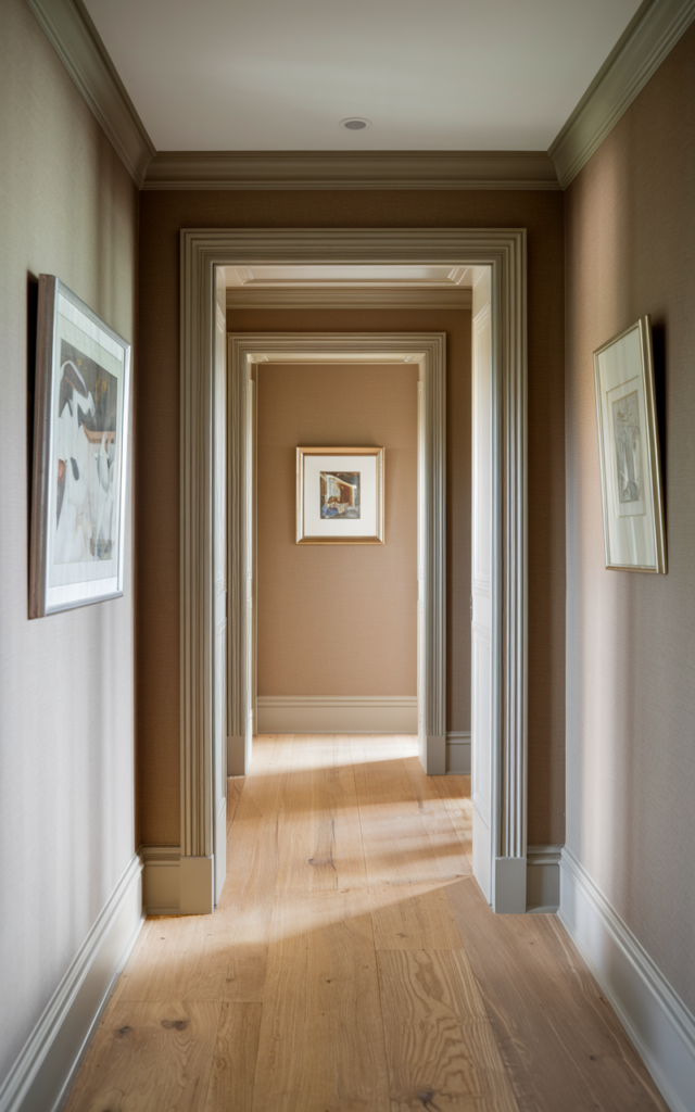
Warm up a hallway using Revere Pewter

Yes, it’s famous. And honestly? It deserves the hype.
Revere Pewter leans greige, but it has enough warmth to keep your hallway from feeling sterile. I’ve used it in narrow spaces and it always feels intentional.
Pair it with matte black hardware or brass fixtures for contrast.
Common Mistakes to Avoid:
- Using cool LED lights
- Pairing with icy gray flooring
- Skipping sample swatches
Trust me. Test it first. Always.
Add depth with Agreeable Gray
This is that “I want neutral but not boring” shade.
It shifts beautifully throughout the day. Slightly warm in sunlight. Slightly muted at night. That subtle change keeps it interesting.
I love it in open-concept homes where you don’t want to commit to beige or gray.
A Micro-tip: Paint the ceiling the same color in smaller rooms. It feels seamless and intentional.
Brighten a kitchen with Alabaster

If crisp white feels too sharp, Alabaster fixes that.
It’s soft. Creamy. Fresh without being cold. Perfect for cabinets or walls — especially if you have warm wood or gold hardware. 🍽️
It reflects light beautifully but doesn’t glare.
Works best in:
- North-facing kitchens
- Homes with warm-toned flooring
- Farmhouse or transitional styles
Ground your dining room in Edgecomb Gray

This one feels tailored. Polished. Quietly elegant.
Edgecomb Gray is lighter than it sounds. It has warmth but still reads airy, which makes it ideal for dining rooms where you want soft sophistication.
Layer in textured curtains and a wood table. Suddenly it feels designer-level. ✨
The psychology behind it: Warm greiges make people feel relaxed. Which is perfect for lingering dinners.Create contrast with Balanced Beige

If you love richer neutrals, try this.
Balanced Beige has depth. It’s not dark, but it holds its own — especially against crisp white trim or built-ins.
I love it in offices. It feels serious but not heavy.
Who this is for:
Anyone bored of pale neutrals and ready for something with a little backbone.
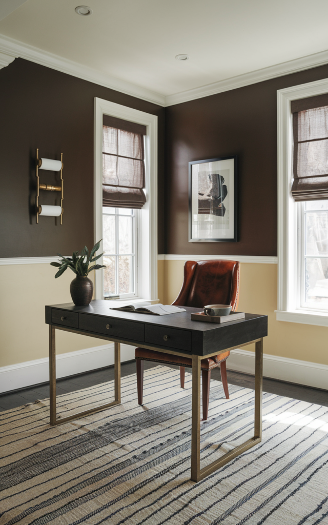
Elevate a home office with Pale Oak

This shade is subtle but sophisticated.
Pale Oak looks almost like a warm whisper on the walls. It reflects light in a way that keeps your office feeling airy but grounded.
I especially love it with warm wood desks and linen curtains.
Actionable Tip:
Sample it on two walls. It can shift depending on sunlight direction.
Wrap your entryway in Shoji White

This is one of those colors that quietly transforms a space.
Shoji White isn’t stark. It’s creamy with a hint of beige, which makes it perfect for entryways that need warmth but still feel light. I’ve used it in homes with dark wood doors and it softens everything instantly.
It also works beautifully if your entry flows into a living room painted in Accessible Beige from the first idea. They complement each other without clashing.
Do’s & Don’ts:
Do this 👉
- Pair with warm metallic accents
- Use soft white trim
- Add natural textures
Not this ❌
- Combine with cool gray flooring
- Use blue-toned lighting
Define an accent wall with Tony Taupe

If you’re nervous about going darker, this is your bridge color.
Tony Taupe has richness. It’s warm, grounded, and makes a gorgeous accent wall behind a bed or fireplace. 🔥
Unlike deep browns, it doesn’t overpower the room. It simply adds dimension.
Step-by-step instructions:
- Paint a large sample first
- Check it morning and night
- Pair with lighter surrounding walls
- Add layered lighting
Trust me. Lighting changes everything.
Keep it airy with Creamy

Creamy is exactly what it sounds like.
It’s warmer than Alabaster, softer than stark white, and feels almost buttery in the best way. I love it in open kitchens and breakfast nooks where you want light — but not clinical light.
It pairs beautifully with warm wood cabinetry and vintage-inspired hardware.
Trend Alert: Creamy whites are replacing cool grays in modern homes. Finally. 🙌
Balance cool flooring using Kiln Dried

Got cool-toned tile or gray flooring you regret? This can help.
Kiln Dried adds earthy warmth without clashing. It’s subtle but strong enough to shift the mood of the room.
Unlike Pale Oak from earlier, this one leans more earthy and grounded.
What most people get wrong:
They try to match the cool floor instead of balancing it. Warm neutrals are your friend here.
Lighten dark rooms with Canvas Tan

If a room feels cave-like, try Canvas Tan.
It reflects light gently and adds warmth without going yellow. I’ve used it in window-limited spaces and it brightens things instantly. ☀️
It’s also forgiving with mixed wood tones.
For people on a budget:
- Paint walls only
- Keep trim existing white
- Update lighting bulbs
Small change. Big impact.
Layer warmth using Barista
This one is bold — for a neutral.
Barista is deep and rich. Perfect for a moody office, reading nook, or even a powder room. It feels intentional.
I like pairing it with lighter neutrals from earlier ideas for balance.
Layer it like this:
- Barista walls
- Creamy trim
- Brass accents
- Textured rug
Instant cozy drama. ☕✨
Refresh cabinets with White Duck

White Duck is that barely-there beige that makes cabinets feel custom.
It’s warmer than plain white but not obviously cream. I’ve used it in kitchens that needed softening without repainting the whole room.
Pair it with matte black or aged brass hardware.
Quick hack: Test it on one cabinet door first. Watch it for 48 hours.
Add softness with Muslin
Muslin is gentle. Cozy. Understated.
It’s ideal for guest rooms where you want comfort without too much personality. Add white bedding, a wood bench, maybe a woven light fixture. Done.
Unlike Manchester Tan earlier, Muslin feels a touch lighter and airier.
One rule to remember:
If you’re unsure, choose the lighter option. Darker always feels heavier once fully painted.
Warm up modern spaces with Anew Gray

Modern homes can feel cold fast.
Anew Gray adds warmth while keeping that clean aesthetic. It’s deeper than Agreeable Gray but still neutral enough for open layouts.
I love it with black windows and light oak floors.
Vibe check:
- Cozy but modern
- Soft but structured
- Warm but not yellow
Soften trim using Greek Villa
Sometimes the walls aren’t the problem. The trim is.
Greek Villa is a warm white that makes trim feel intentional instead of harsh. I’ve used it with both beige and greige walls and it blends beautifully.
It pairs especially well with Alabaster from earlier.
Surprise Fact:
Warm white trim can make wall colors look richer and more expensive. 🎨
Embrace earthy undertones in sun-filled rooms

If you’re lucky enough to have tons of sunlight, lean into earthy neutrals.
Think Kiln Dried or Balanced Beige. Sunlight enhances warmth, so these shades glow instead of looking dull.
But here’s the catch — too much yellow can go golden fast.
Decision Fatigue?
Ask yourself:
- Do I want cozy or airy?
- Do I have warm or cool flooring?
- What time of day is brightest?
Answer those. The color becomes obvious.
Paint ceilings in warm neutrals for intimacy

Here’s something most people skip — the ceiling.
Instead of default white, try Pale Oak or Creamy overhead in a bedroom or dining room. It lowers visual contrast and makes the space feel wrapped in comfort.
This works beautifully in rooms with high ceilings that feel disconnected.
Time required to implement:
A weekend. Maybe less if you’re motivated. It’s subtle. But once you notice it, you can’t unsee how polished it looks.
Choose richer neutrals for cozy evenings

If your home is mostly used at night, go slightly deeper.
Tony Taupe, Barista, or Anew Gray create mood after sunset. They absorb light instead of reflecting it, which feels intimate and warm. 🕯️
Unlike light neutrals, these don’t wash out under lamps.
Do’s & Don’ts:
Do
- Layer lamps
- Use dimmers
- Add warm bulbs
Don’t
- Overuse cool LEDs
- Skip wall samples
Evening lighting changes everything.
Coordinate warm neutrals with flooring

Flooring matters more than people think.
If you have warm oak, lean toward Accessible Beige, Manchester Tan, or Muslin. If your floors are slightly gray, try Edgecomb Gray or Anew Gray to bridge the gap.
The goal? Harmony. Not perfect matching.
And remember what I said earlier — balance, don’t fight the undertones.
It makes the entire home feel intentional instead of accidental. 🏡
Refresh old beige with updated warm greiges
If your home has 2000s builder beige, don’t panic.
You don’t need to swing hard into white. Instead, modernize with warm greiges like Agreeable Gray or Pale Oak.
They feel fresh without being trendy.
Unlike stark whites, they still feel cozy.
It’s a gentle update. One that won’t feel dated in five years.
Trust your eye and go warmer than you think

Here’s the honest truth.
Most people choose paint that’s too cool. Too safe. Too gray.
When in doubt, go slightly warmer than your first instinct. Homes feel better when they’re warm. More inviting. More human. ❤️
You can always add contrast with furniture and decor. But paint sets the mood.
And warm neutrals? They rarely let you down.
Final Thoughts
Warm neutrals are timeless for a reason. They flex. They soften. They make homes feel lived in.
Start small if you need to. Test a bathroom. Try a bedroom. See how it feels.
But don’t overthink it. Pick one of these 24 best warm neutral paint colors ideas and give it a shot. Your walls might just thank you. 🎨✨