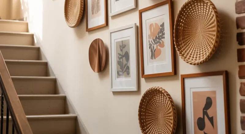
If there’s one spot in your home that quietly begs for attention, it’s the staircase wall.
It’s tall.
It’s awkward.
And most people either ignore it… or hang three lonely frames and call it a day.
But trust me, your stairs deserve better. A well-styled gallery wall can turn that pass-through space into the most talked-about feature in your home. So let’s dive into my favorite 21 staircase gallery wall ideas — practical, creative, and totally doable. 🎨✨
Mix Black and White Frames for Contrast
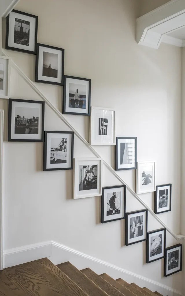
Instead of matching everything perfectly, play with contrast.
Alternate black and white frames while keeping the artwork cohesive. The mix adds subtle drama without feeling chaotic. I usually recommend sticking to black-and-white photography if you go this route.
It’s bold. Clean. Sophisticated.
Quick Tip:
Lay everything out on the floor first and snap a photo before hanging. It saves you from unnecessary nail holes. 🖼️
Follow the Stair Angle Precisely
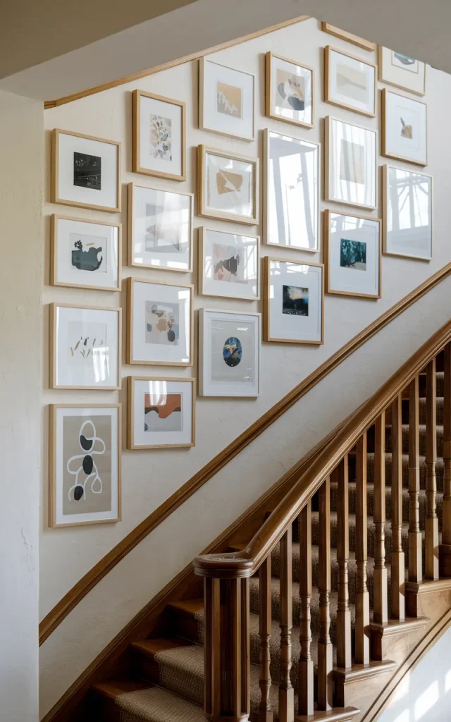
This one’s for the perfectionists.
Line your frames exactly along the angle of the stairs. Measure the incline and maintain equal spacing between frames. It looks intentional and architectural.
Remember the second idea where we embraced contrast? Unlike that slightly playful vibe, this one is structured and precise.
Tools you may need (checklist type bullet points):
- Painter’s tape
- Level
- Measuring tape
- Paper templates
- Pencil
Trust me — templates are your best friend here. 📐
Incorporate Personal Travel Memories
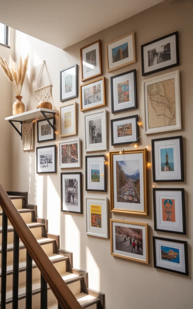
Turn your staircase into a travel journal.
Frame postcards, maps, tickets, or photos from your trips. Arrange them by country or city as you go upward.
It sparks conversation. And nostalgia.
Who this is for:
- Frequent travelers
- Families who love storytelling
- Anyone who wants meaning over trends 🌍
Go Minimal With Matching Mats
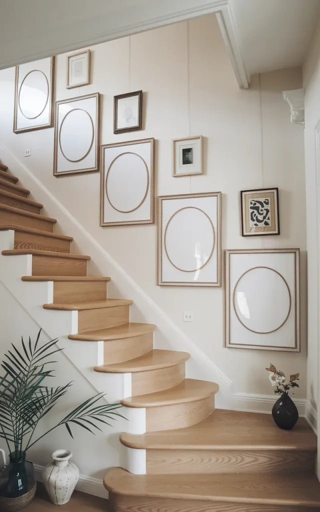
If you love calm spaces, keep it simple.
Use identical frames and oversized white mats. Let the artwork breathe. The uniformity feels serene and balanced.
This works beautifully in modern or Scandinavian-inspired homes.
One rule to remember:
Keep spacing consistent — usually 2–3 inches between frames. Consistency equals calm. 🤍
Mix Art Prints With Wall Sculptures
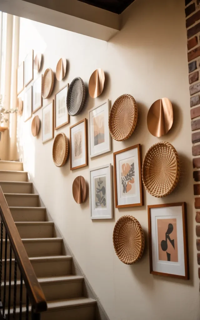
Gallery walls don’t have to be flat.
Add small wall sculptures, woven baskets, or metal pieces between framed prints. It creates texture and depth.
Just don’t overcrowd it.
Common Mistakes to Avoid:
- Mixing too many colors
- Ignoring scale
- Hanging everything too high
- Forgetting breathing space
A little restraint goes a long way.
Paint a Bold Backdrop First
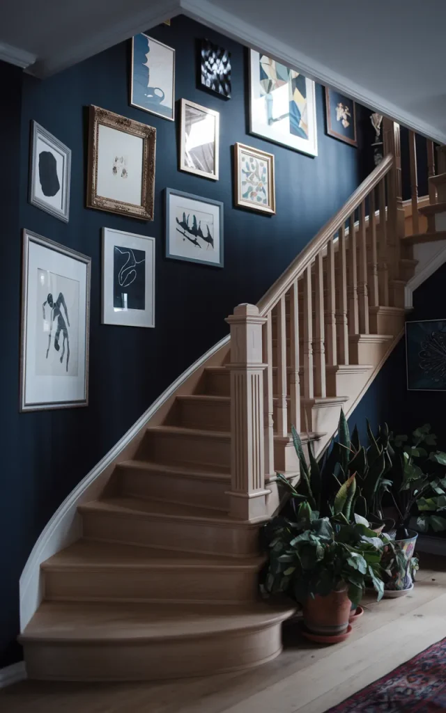
Want instant drama? Paint the staircase wall a bold color before adding frames.
Deep navy. Forest green. Even charcoal.
The frames will pop like crazy against it.
Trend Alert:

Moody staircases are having a moment right now — and I’m here for it. 🎨🔥
Arrange Frames in an Organic Cluster
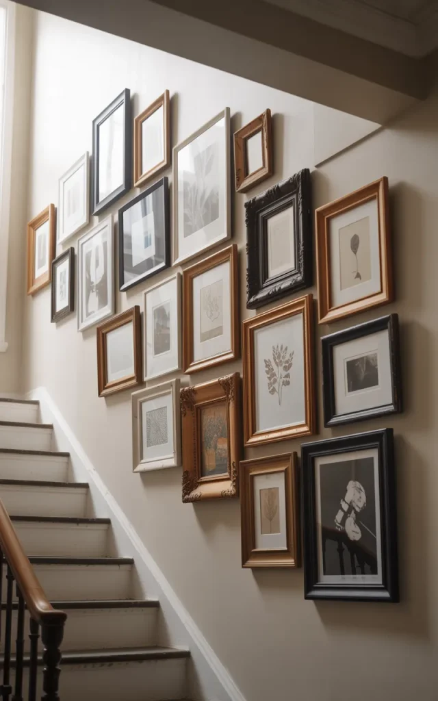
Forget straight lines for a second.
Create a free-flowing cluster that feels collected over time. Vary frame sizes. Let some pieces sit slightly higher or lower.
It feels curated rather than calculated.
Unlike idea four where we followed the stair angle precisely, this one thrives on imperfection.
Step-by-step instructions:
- Start with your largest piece as an anchor.
- Build outward with medium frames.
- Fill gaps with smaller pieces.
- Maintain roughly equal spacing.
The key? Step back often. Adjust. Trust your eye. 🎨
Highlight Black-and-White Photography Only
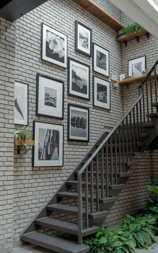
There’s something powerful about monochrome.
Dedicate your entire staircase gallery wall to black-and-white photography. Portraits, landscapes, architecture — mix them all.
It feels cohesive even when subjects vary.
Why designers do this:
Black-and-white instantly creates unity. It removes color distractions and focuses on composition. This approach works especially well if the rest of your home is colorful. It creates visual balance without competing.
Install Wall Sconces Between Frames
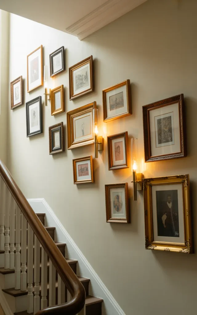
Lighting changes everything.
Add slim wall sconces between sections of your gallery wall. It highlights your art and adds warmth during the evening.
Soft light + meaningful art = cozy perfection. 🕯️
Time required to implement:
- Planning layout: 1–2 hours
- Electrical install: Half day (with an electrician)
Totally worth it for the ambiance alone.
Use a Monochrome Color Theme
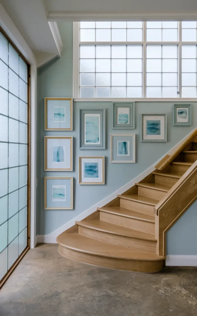
Pick one color family and stick to it.
For example, soft blues — navy prints, powder-blue abstracts, muted landscapes. The variation in tone keeps it interesting without overwhelming the eye.
Colour swap suggestion:
| If you love… | Try this instead… |
| Bright red | Muted terracotta |
| Royal blue | Dusty navy |
| Neon pink | Blush |
Subtle shifts feel more elevated and timeless.
Showcase Kids’ Artwork in Matching Frames
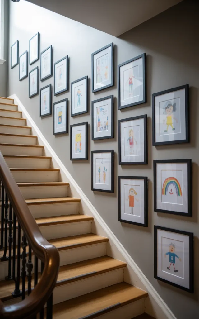
This one melts my heart.
Frame your kids’ artwork in identical frames with white mats. Suddenly those crayon masterpieces look gallery-worthy.
It celebrates creativity without looking messy.
For people on a budget:
- Use IKEA frames
- Print digital scans of artwork
- Rotate pieces seasonally
It’s affordable. Personal. And seriously charming. 🎨❤️
Combine Vintage and Modern Pieces
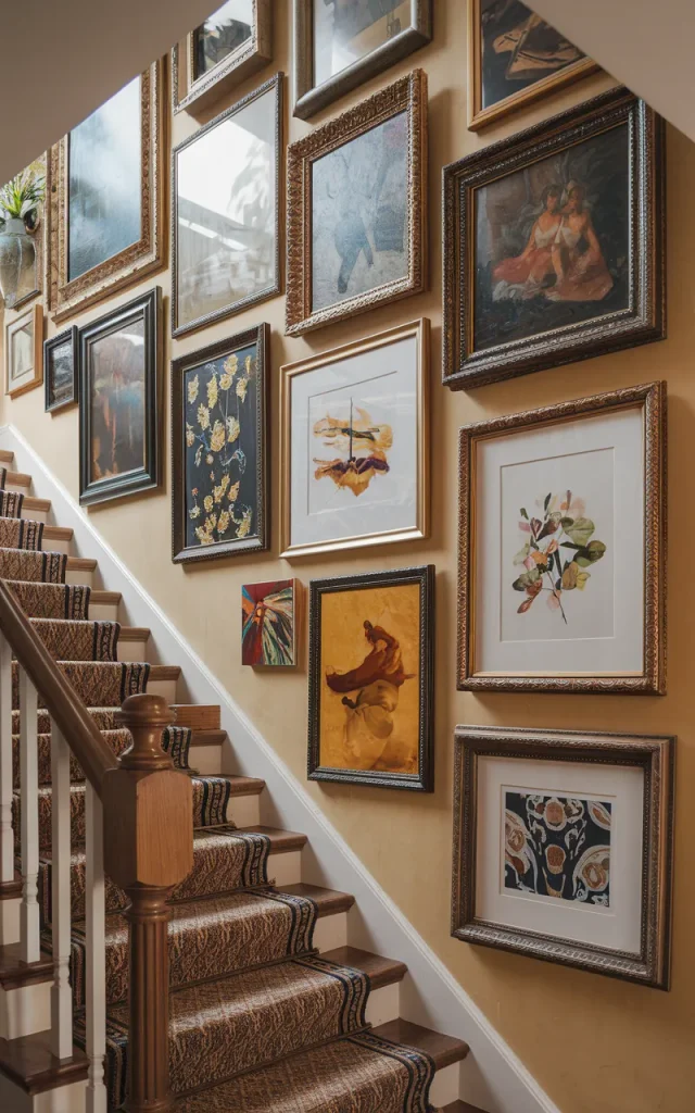
Blend old oil paintings with sleek modern prints.
The contrast tells a story. It feels layered and intentional — like you’ve been collecting for years.
Remember the monochrome idea earlier? Unlike that cohesive vibe, this approach leans into contrast and character.
Vibe check:
- Eclectic but balanced
- Personal, not trendy
- Warm and storied
It’s perfect for homes with personality.
Frame Meaningful Quotes and Typography
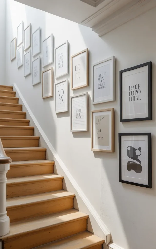
Words matter.
Mix short quotes, song lyrics, or family mottos with simple graphics. It adds personality without overwhelming the space.
Keep fonts consistent for cohesion.
What most people get wrong:
Using too many fonts. Stick to two, max. Simple typography can be surprisingly powerful.
Install a Gallery Wall That Wraps the Corner
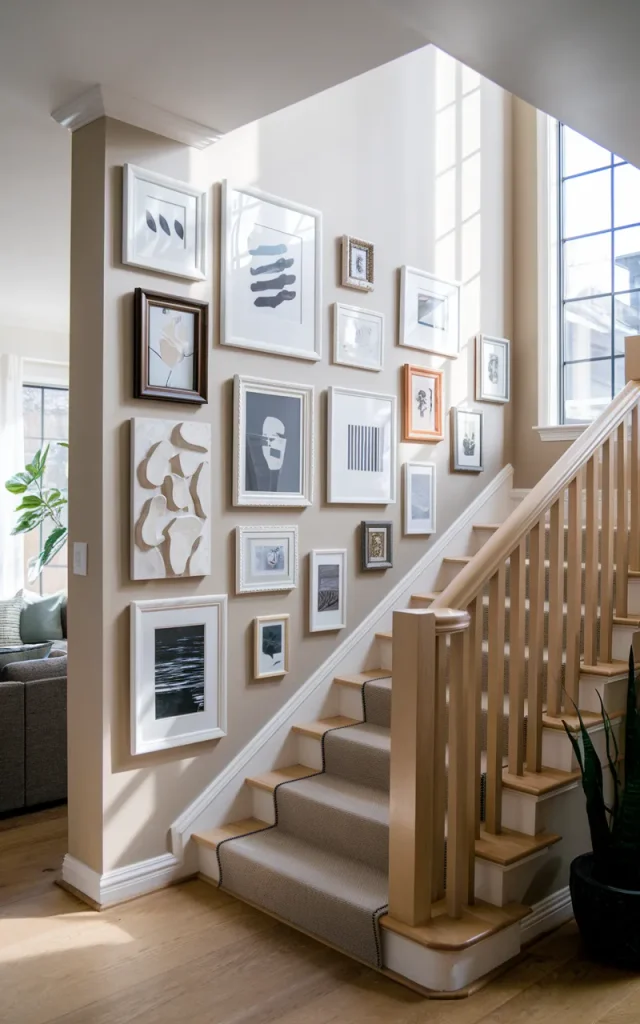
If your staircase turns, let the gallery wall follow it.
Wrap frames around the corner for a seamless look. It makes the whole staircase feel intentional.
Plan the corner connection carefully so spacing stays consistent.
This technique works especially well in modern homes with sharp angles. 🏠
Embrace Floor-to-Ceiling Drama
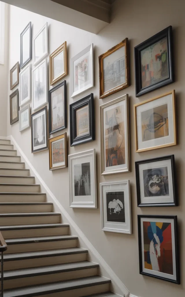
Go all in.
Cover the entire staircase wall from baseboard to ceiling with art. Large pieces at the bottom. Smaller ones filling upward gaps.
It feels immersive. Bold. Almost museum-like.
But balance is everything. Too many tiny frames will feel cluttered.
Cost breakdown box:
| Item | Estimated Cost |
| Frames | $300–$800 |
| Prints | $200–$600 |
| Hardware | $50–$100 |
Yes, it’s an investment. But the impact? Massive. 🎭
Mix Canvas Art With Framed Prints
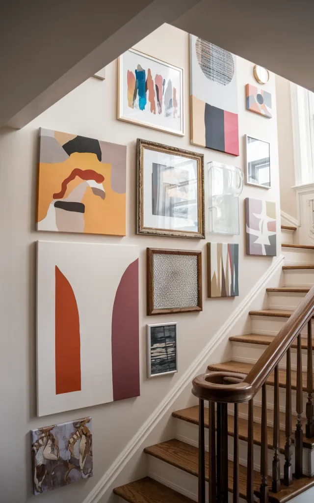
Don’t limit yourself to glass-covered frames.
Combine stretched canvas pieces with framed prints. The texture difference creates depth.
Position canvas pieces slightly offset from framed art for movement.
Do’s & Don’ts:
Do this 👉
- Mix 2–3 textures max
- Anchor with one large piece
- Keep spacing consistent
Not this ❌
- Mix five frame finishes
- Ignore scale
- Cram everything too tight
Balance always wins.
Create a Themed Art Collection
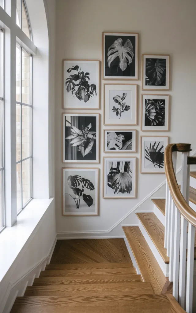
Pick a theme — botanicals, architecture, ocean photography, abstract shapes — and stick to it.
A clear theme keeps things cohesive even if frame styles vary.
It feels intentional instead of random.
You’ll notice how calm it looks compared to the eclectic mix in idea 16. Both are great. Just different moods.
Choose what fits your personality. 🌊
Use Oversized Mats for a Gallery Feel
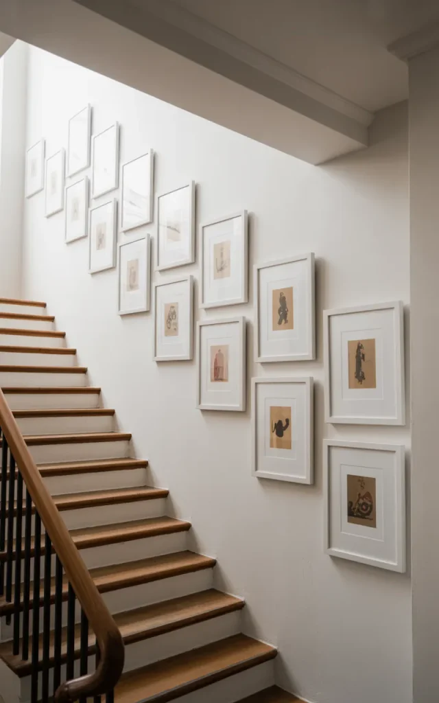
Oversized white mats make even small prints feel important.
The extra breathing space adds sophistication and prevents visual clutter.
This works beautifully in narrow staircases.
Keep frame colors neutral so the mat does the heavy lifting.
It’s simple. But incredibly refined.
Add Subtle LED Strip Lighting Behind Frames
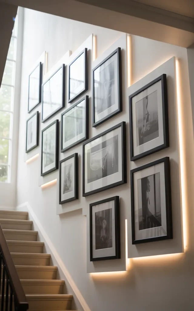
For a modern twist, install soft LED strips behind larger frames.
It creates a floating effect at night. Almost magical.
Keep the light warm, not cool.
It pairs beautifully with the bold painted backdrop from idea 10. Remember that moody wall? Add backlighting and it becomes pure drama. 🔥
Design a Black-and-Gold Luxe Gallery Wall
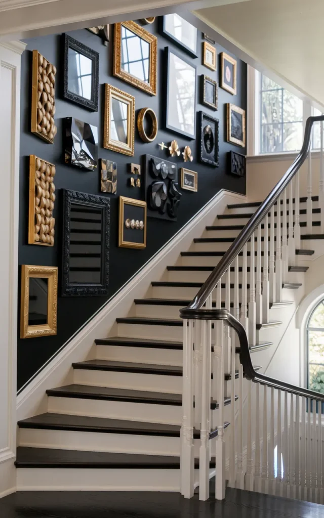
If you love glam, go black and gold.
Black frames. Gold accents. Dark artwork. Maybe even a velvet-textured wall paint.
It feels rich and elevated.
Layer metallic elements sparingly so it doesn’t feel gaudy.
Trust me — restraint is elegance. ✨
Rotate Artwork Seasonally
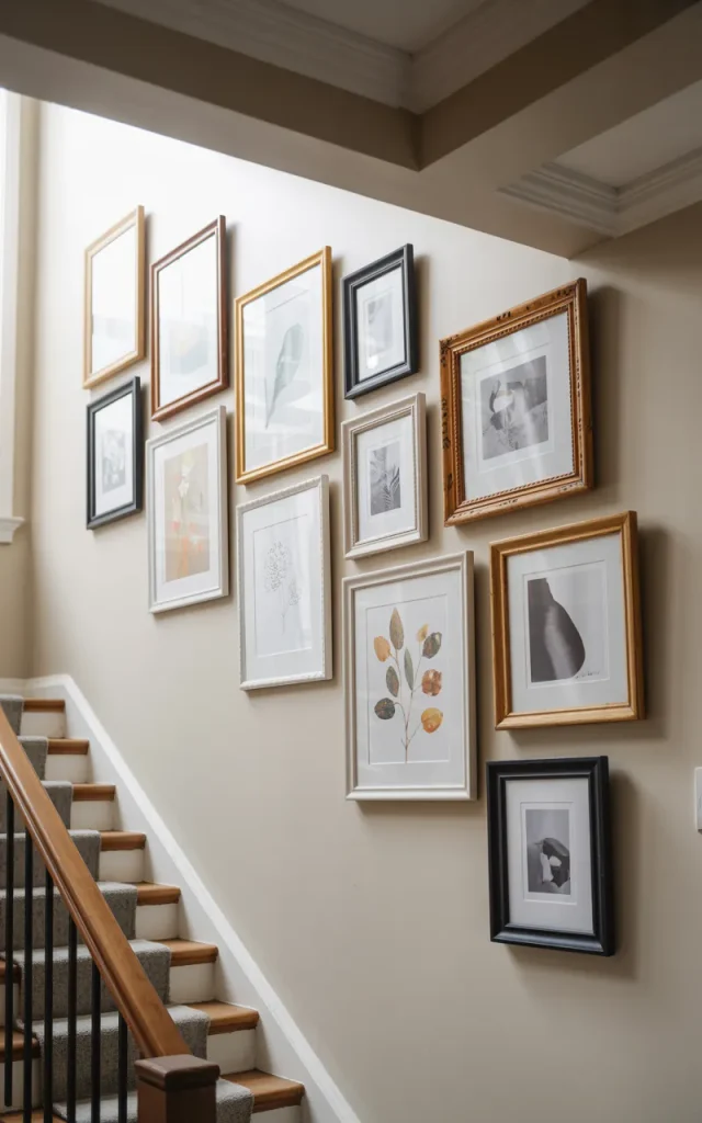
Why commit forever?
Create a staircase gallery wall system where art can be swapped out quarterly. Use easy-open frames or ledges.
Fall landscapes in autumn. Bright abstracts in summer.
It keeps things fresh without a full redesign.
And honestly? It makes your home feel dynamic and alive. 🌼
Final Thoughts
Your staircase isn’t just a walkway. It’s a blank canvas.
Whether you go minimal with matching mats or bold with floor-to-ceiling drama, there’s one thing I always say: make it yours.
Pick one idea from these 21 staircase gallery wall ideas and try it this weekend. Start small if you need to. Adjust as you go.
And most importantly? Have fun with it. Your walls are waiting. 🖼️✨
