Let me tell you—staircases are wildly underrated.
Most people treat them like a transition space. Just… steps that get you from point A to B. But honestly? That wall beside your staircase is one of the best blank canvases in your home.
I’ve played around with staircase painting ideas more times than I can count, and every single time, it changes the entire vibe of the house.
So if you’ve been staring at that boring stair wall wondering what to do… I’ve got you. Let’s turn it into something you actually love walking past every day.
Paint a soft ombré gradient along the staircase wall
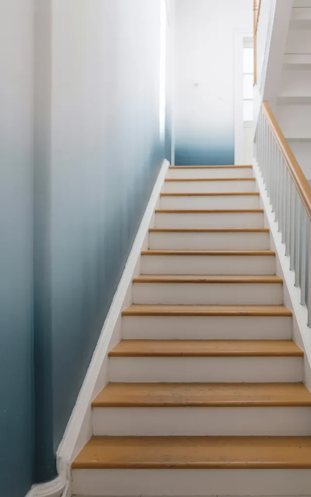
This is one of my forever favorites.
Start with a deeper tone at the bottom and slowly fade it into a lighter shade as you move up. It creates a natural flow that visually lifts the space.
I love using calming tones—like dusty blue fading into white or warm beige into cream. It feels soft. Effortless.
✨ Why it works?
The gradient mimics upward movement, so your eye naturally follows the stairs. It makes even a small staircase feel taller and more open.
Create a bold geometric mural for a modern edge
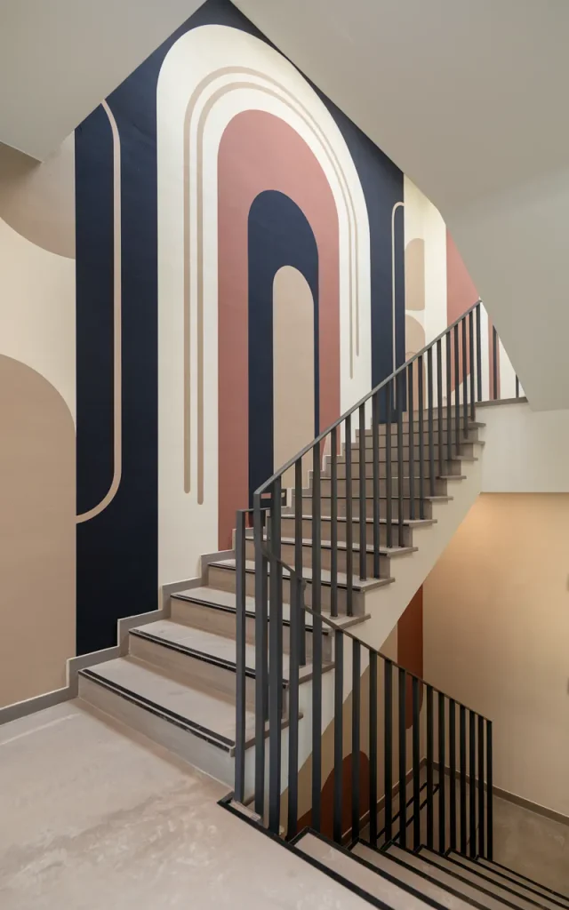
If you want something eye-catching, go geometric.
Think triangles, arches, or abstract blocks of color. You don’t need to be an artist—painter’s tape is your best friend here.
I usually stick to 2–3 colors so it doesn’t feel chaotic. Clean lines = instant sophistication.
🛠 Tools you may need:
- Painter’s tape
- Level
- Small detail brushes
- Matte wall paints
Paint vertical stripes to elongate the space
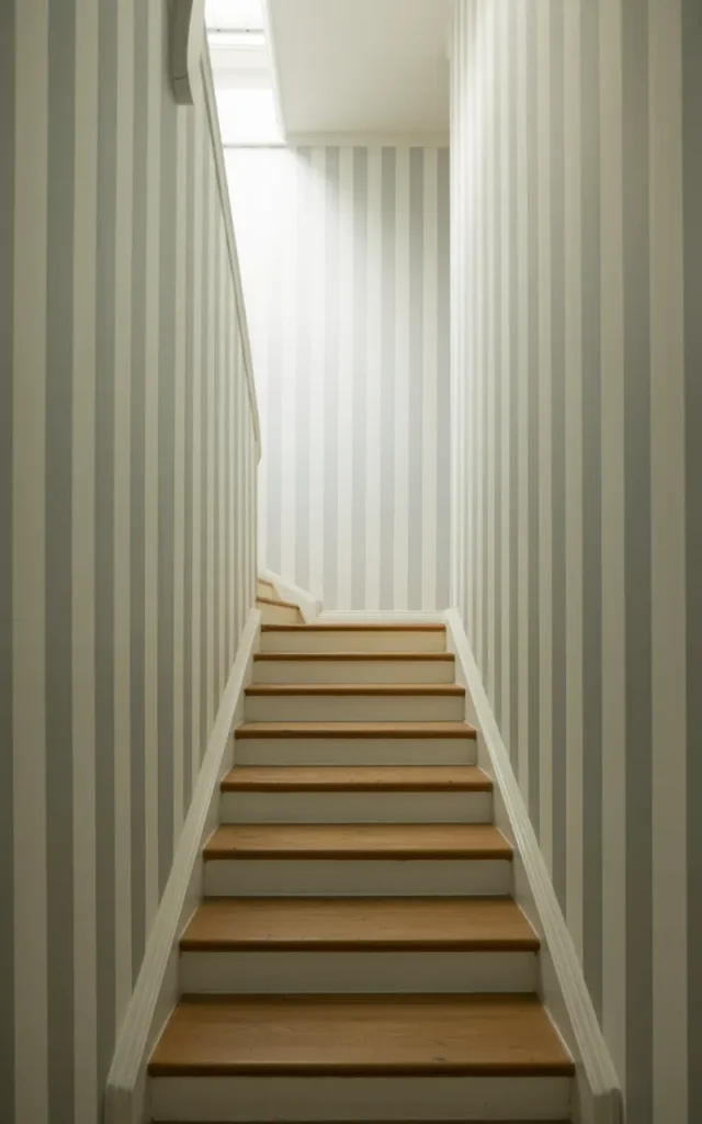
This trick is simple. But wow, does it work.
Vertical stripes draw the eye upward, making your ceiling feel higher than it actually is. I’ve used this in tight staircases and the difference is immediate.
Go subtle with tone-on-tone stripes if you want elegance. Or contrast them for a bolder look.
✨ Quick Tip:


Keep stripe widths consistent. Uneven spacing can make the wall feel messy instead of intentional.
Add a half-painted wall with a clean horizontal line
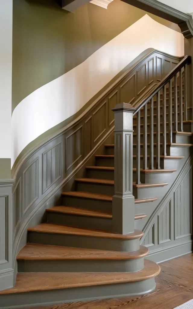
This one is minimal but impactful.
Paint the bottom half of the wall in a rich color—like charcoal, olive, or navy—and keep the top half light. It grounds the space beautifully.
I love pairing this with wooden stairs. The warmth + color combo? Chef’s kiss.
👉 Thumb Rule:


Keep the painted section aligned with stair height for a seamless, intentional finish.
Paint a staircase mural that tells a story
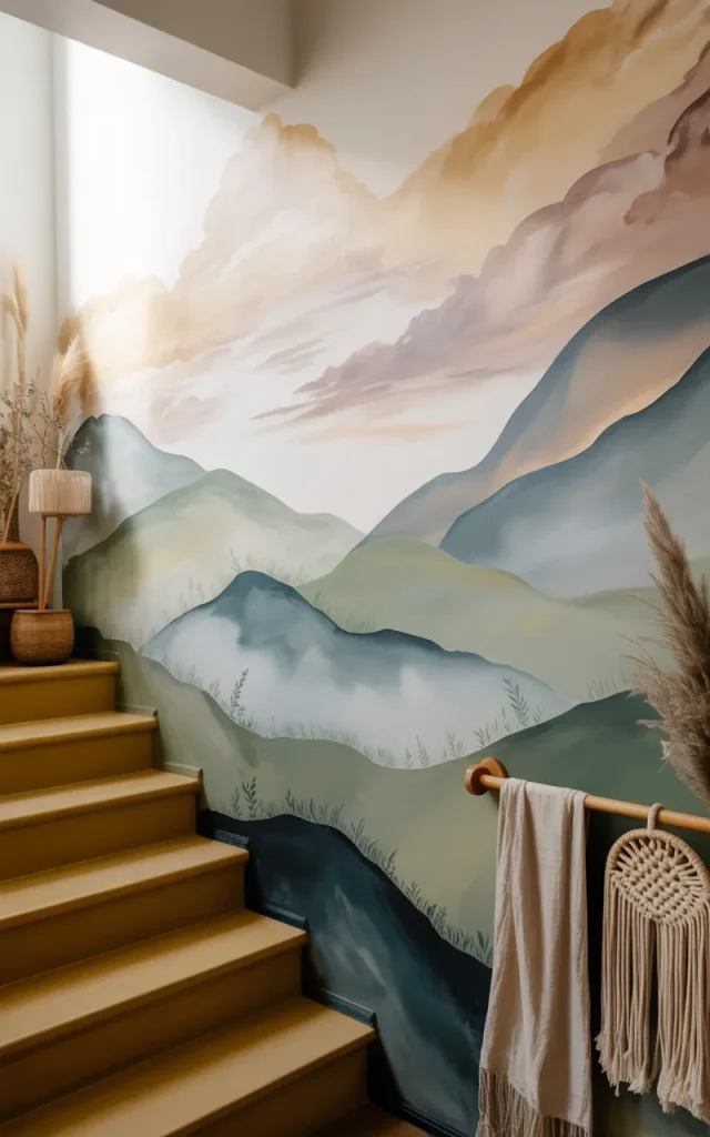
Okay, this is for the creative souls.
Think nature scenes, abstract waves, or even a subtle cityscape. It doesn’t have to be perfect—it just has to feel like you.
I once did a soft mountain-inspired mural, and every time I walked up, it felt like a mini escape.
🎯 Who this is for:
- Artistic personalities
- People who love statement walls
- Anyone bored of plain paint
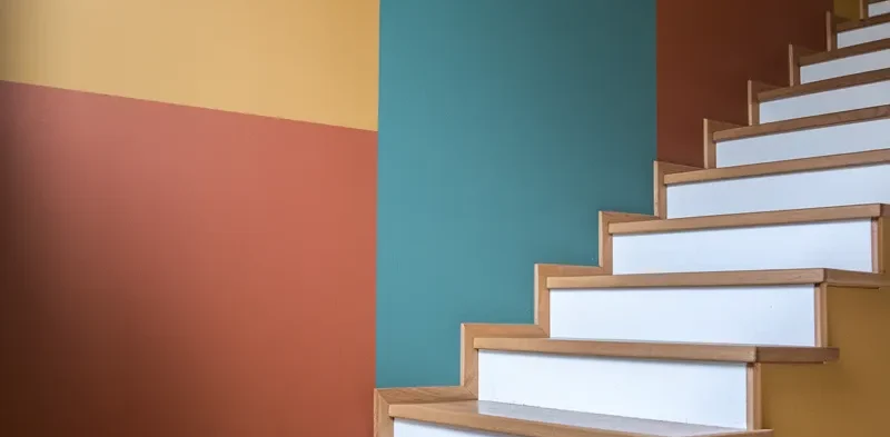
Use color blocking to define the stair path
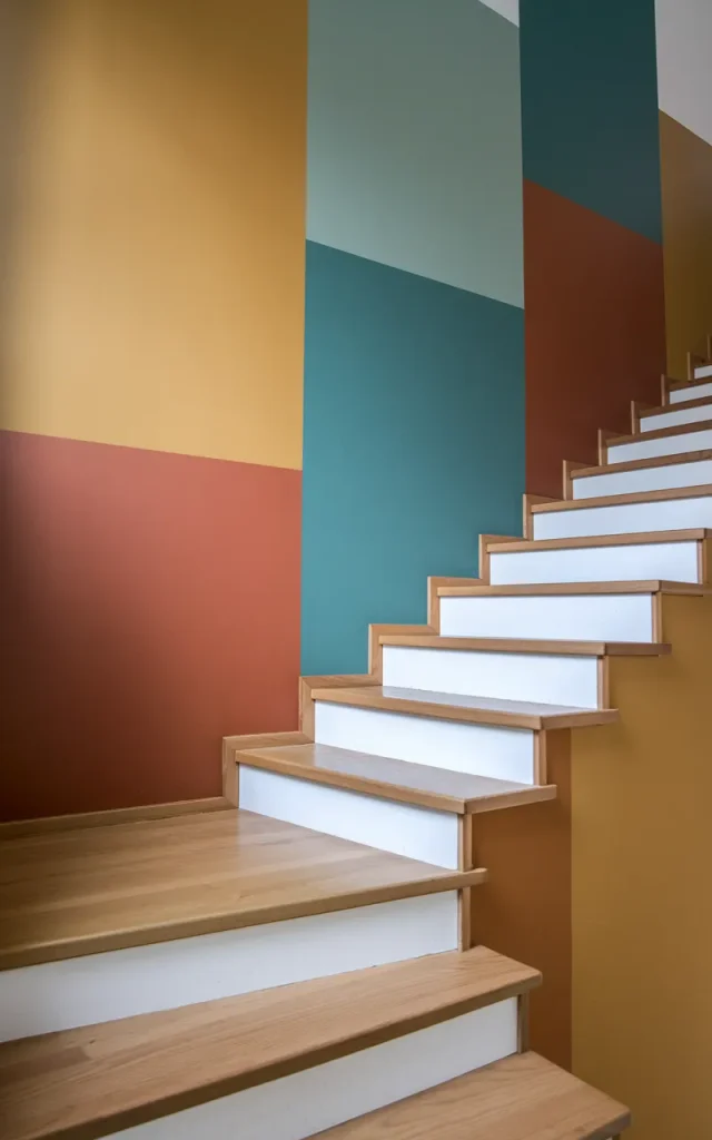
Color blocking is such a smart move.
You can paint shapes that follow the angle of your staircase, almost like guiding lines. It makes the whole area feel designed, not accidental.
Try earthy tones if you want it grounded. Or go bold with mustard, teal, and rust.
💡 A Micro-tip:
Match one of the colors with your décor nearby for a cohesive look.
Paint the stair risers in alternating colors
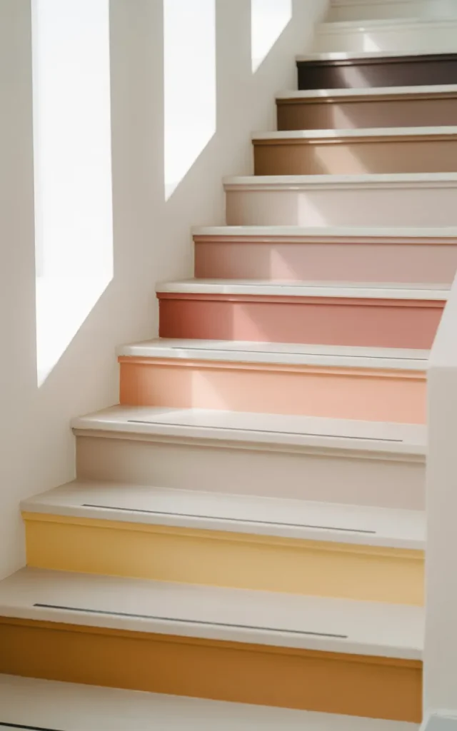
This one is playful and unexpected.
Instead of focusing only on the wall, paint each stair riser a different shade. It adds personality without overwhelming the space.
I love soft gradients here too—each step slightly lighter than the previous.
⚡ Instant Gratification Tip:
Start with just 3–4 stairs if you’re unsure. You can always continue later.
Create a monochrome palette for a chic look
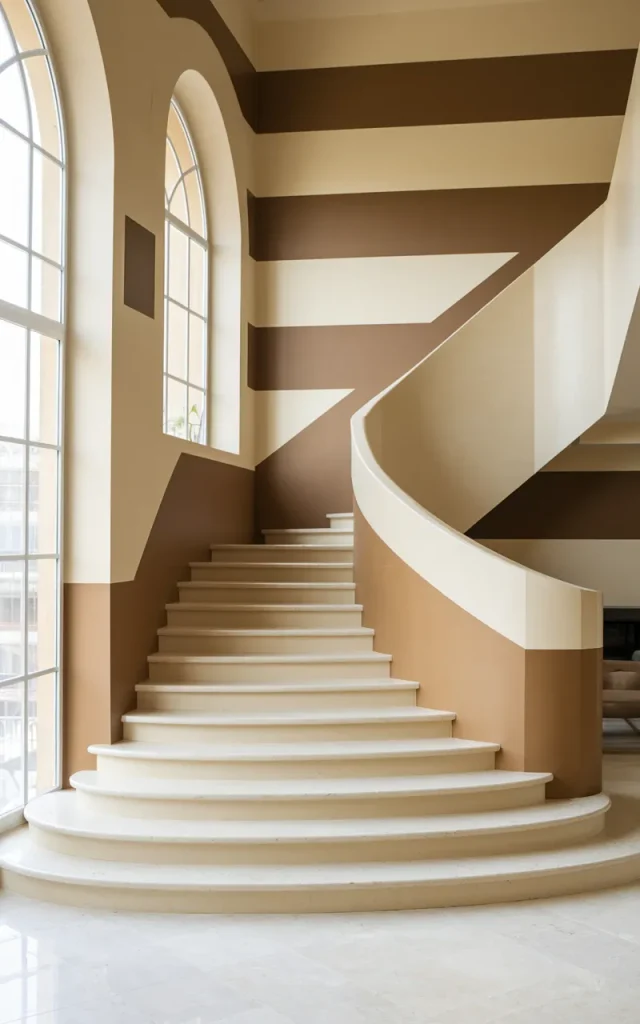
If bold isn’t your thing, go monochrome.
Different shades of the same color—like greys or beiges—can create depth without being loud. It feels calm. Put together.
Honestly, this is my go-to when I want something timeless.
🎨 Colour swap suggestion:
| Base Tone | Pair With |
| Warm beige | Cream + tan |
| Cool grey | Charcoal + silver |
Paint a faux arch to frame the staircase
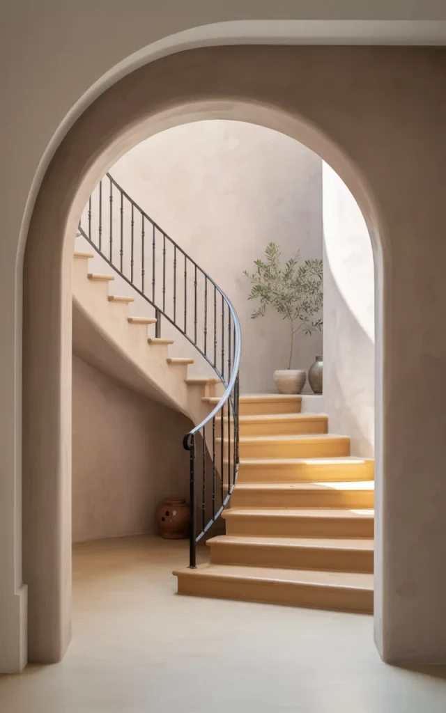
This trick is magic.
A simple painted arch can make your staircase feel architectural—even if it’s just a flat wall.
I love doing this behind the lower steps or around a landing.
✨ Why designers do this:


It adds structure and visual interest without needing actual construction.
Add a playful polka dot pattern
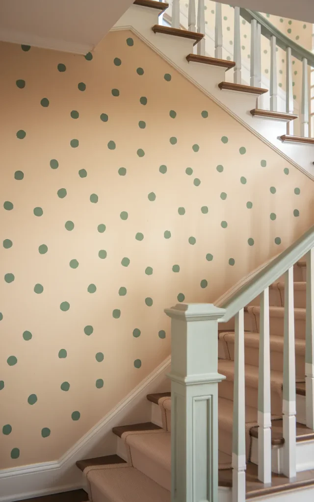
Hear me out—this can look so cute when done right.
Small, evenly spaced dots in soft colors can make the staircase feel light and fun. Perfect for family homes.
Keep the palette subtle if you don’t want it to feel childish.
✔️ Checklist:
- Choose 2–3 colors
- Maintain equal spacing
- Use a stencil for consistency
Paint a gallery-style backdrop wall
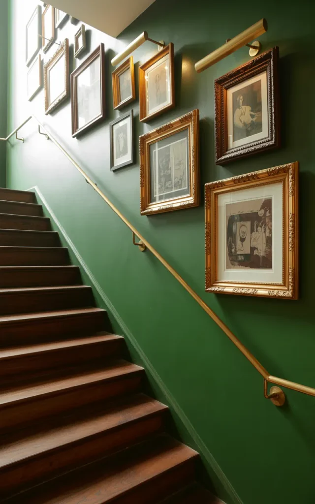
Instead of hanging art randomly, paint a backdrop first.
A deep tone like forest green or navy creates the perfect canvas for frames. It makes everything pop instantly.
I did this once and suddenly even my mismatched frames looked curated.
💡 Step-by-step instructions:
- Pick a bold base color
- Paint the entire stair wall
- Let it fully dry
- Arrange frames in a loose grid
- Adjust spacing before hanging
It’s simple. But the effect? Designer-level.
Paint a chalkboard wall for creativity
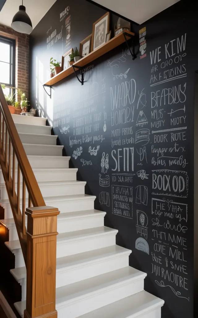
This is such a fun idea, especially for families.
Turn your staircase wall into a chalkboard where you can doodle, write quotes, or leave notes.
It’s interactive. Always changing.
🎯 Works best in:
- Family homes
- Creative spaces
- Casual interiors
And honestly… it’s just fun to have.
Use earthy tones for a grounded feel
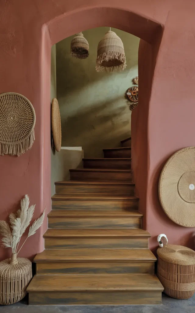
Think terracotta, olive green, warm brown.
These colors make the staircase feel cozy and connected to nature. I love this especially in homes with wooden accents.
🌱 The psychology behind it:


Earth tones create a sense of stability and calm. Perfect for transitional spaces like stairs.
Highlight each step edge with paint lines
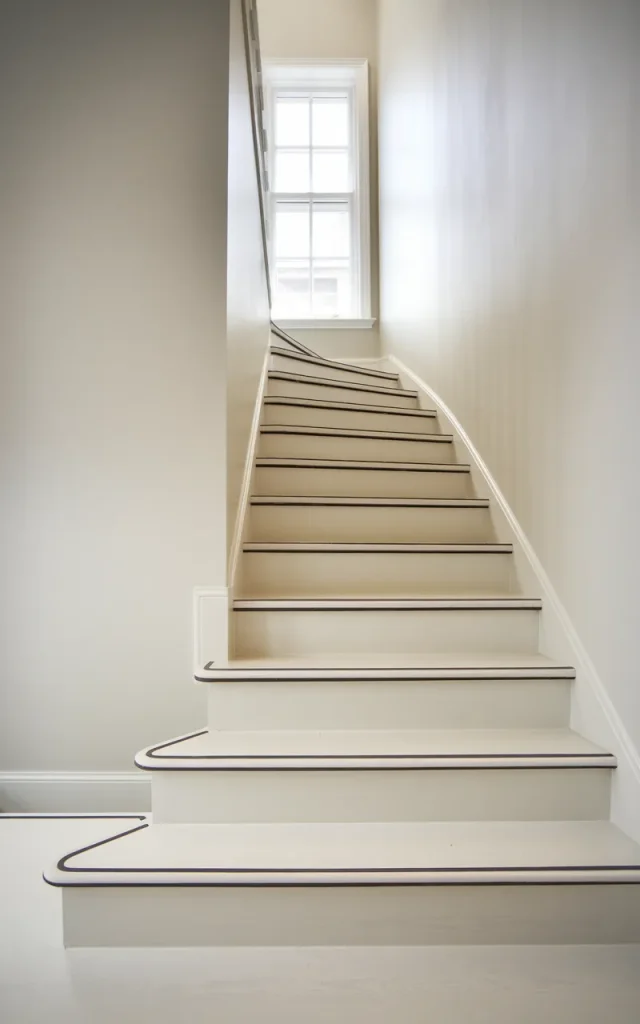
This one is subtle but clever.
Paint thin lines along the edge of each step or along the wall beside them. It creates rhythm and structure.
It’s almost like outlining the staircase.
💡 Budget Alternatives:
- Use painter’s tape for clean edges
- Try peel-and-stick decals
- Use leftover paint from other rooms
Paint abstract brush strokes for an artistic feel
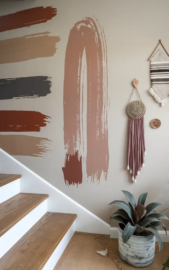
This is freedom.
No rules. Just large, expressive strokes across the wall. It feels raw and personal.
Remember idea #5? This is like its more relaxed cousin.
💭 A pull quote:


“Your home should feel like your personality, not a catalog.”
Introduce a seasonal color shift
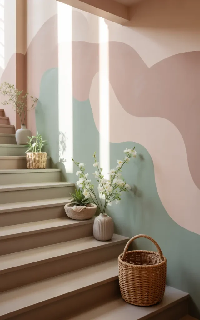
This one is fun if you like switching things up.
Choose a base neutral wall, then repaint a section or accent area seasonally—soft pastels in spring, warm tones in autumn.
It keeps your home feeling fresh without a full redo.
🔄 Seasonal Switch:
| Season | Color Idea |
| Spring | Mint + blush |
| Autumn | Rust + mustard |
It’s like giving your staircase a wardrobe change.
Go all-in with a high-gloss painted finish
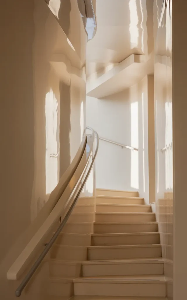
Matte is safe. Gloss is bold.
A high-gloss finish reflects light beautifully, especially in narrow staircases. It instantly elevates the space.
I usually recommend this for modern homes.
💡 Time required to implement:
- Prep: 1–2 days
- Painting: 1 day
- Drying: 24–48 hours
Totally worth the effort.
Paint a tonal checkerboard pattern
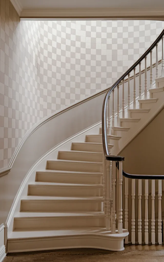
This one feels classic but fresh.
Use two shades of the same color to create a soft checkerboard effect. It adds interest without being too loud.
I like this more than high-contrast checks—it feels calmer.
🧠 Decision Fatigue?
Stick to one color family. It simplifies everything instantly.
Paint a bold accent landing zone
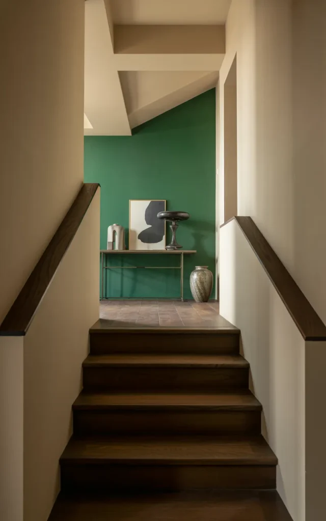
If your staircase has a landing, treat it like a moment.
Paint that section in a completely different color. It breaks the monotony and adds personality.
I love using jewel tones here—emerald, sapphire, deep plum.
🎯 Vibe check:
- Calm → muted tones
- Bold → jewel tones
- Playful → bright colors
Keep it simple with a crisp fresh white repaint
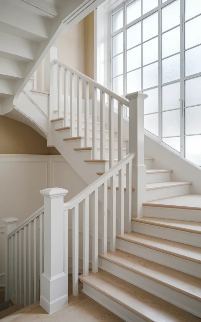
Sometimes… simple wins.
A fresh coat of white can completely transform a tired staircase. It brightens everything. Makes the space feel clean and new.
And honestly, after all the bold ideas we talked about? This one feels like a reset.
✨ Myth-buster:
White is not boring. It’s a canvas. What you pair with it makes all the difference.
Final Thoughts 💭
Here’s the thing—your staircase doesn’t have to be forgettable.
It can be bold. Calm. Playful. Dramatic. Whatever fits you.
Start small if you need to. Maybe just one wall. One idea. One color. And then build from there.
Because once you see that transformation… trust me, you’ll want to keep going 🎨✨
