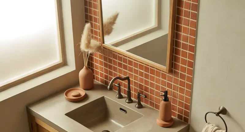
Your bathroom doesn’t have to look plain or feel like an afterthought. Sometimes, all it takes is the right combination of colors to turn an ordinary space into something beautiful, relaxing, and surprisingly luxurious. ✨
When I think about bathroom design, I always start with the color palette. It sets the mood, influences how spacious the room feels, and helps every little detail come together. Whether you love moody interiors, soft neutrals, earthy tones, or bold contrasts, there’s a combination that can work beautifully in your home.
So, if you’re looking for bathroom color scheme ideas that feel fresh, practical, and easy to recreate, I’ve gathered 22 options worth considering. From timeless black and white to unexpected shades of green, let’s find a palette you’ll love seeing every morning.
Pair Warm White With Natural Beige for a Timeless Bathroom
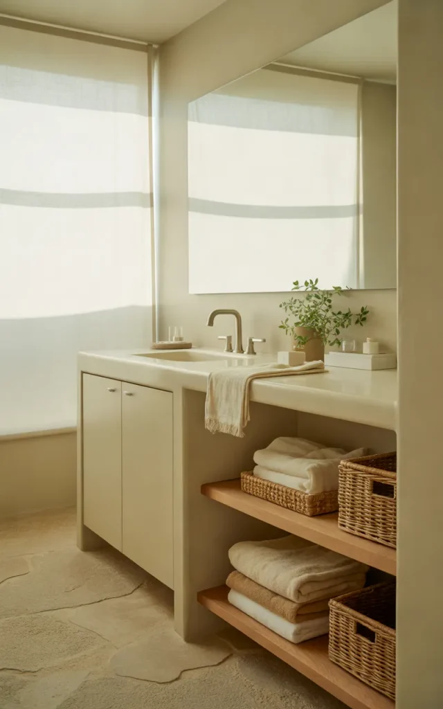
If I wanted a bathroom that felt clean without looking cold, I’d start with warm white and natural beige. This combination creates a soft, welcoming atmosphere that works with almost any decorating style. Think creamy white walls, beige floor tiles, and a white vanity with simple hardware.
The beauty of this palette is its flexibility. You can introduce wooden shelves, woven baskets, or linen towels without worrying about clashing colors. Everything feels connected.
I’d also use a slightly warmer white for the walls rather than a stark, brilliant white. It makes a noticeable difference, especially in bathrooms with limited natural light.
A Micro-tip:
Keep the largest surfaces neutral and introduce texture through towels, bath mats, and accessories. This gives the room depth without making it feel busy.
Combine Charcoal Gray and Crisp White for Modern Contrast
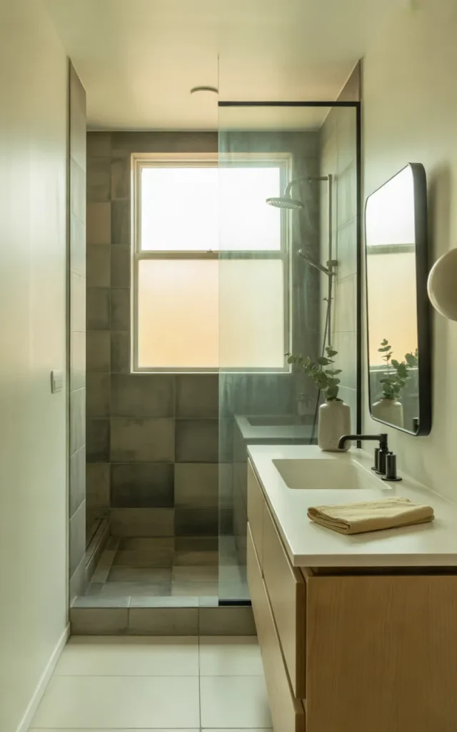
Charcoal gray and crisp white are perfect if you love a modern bathroom with a little drama. I particularly like this combination in bathrooms with clean lines, frameless mirrors, and minimalist fixtures.
Try charcoal tiles inside the shower, white walls around the vanity, and a bright white countertop. The contrast creates definition without requiring lots of decorative details. A simple black-framed mirror can tie everything together.
If your bathroom is small, don’t feel that you need to abandon dark colors completely. Use charcoal on one feature wall or within the shower area, then let white surfaces keep the rest of the room feeling open.
Why it works:

White reflects available light, while charcoal adds visual weight. Together, they create a balanced look that feels sophisticated rather than overly stark. 🖤
Mix Navy Blue and White for a Classic Coastal Look
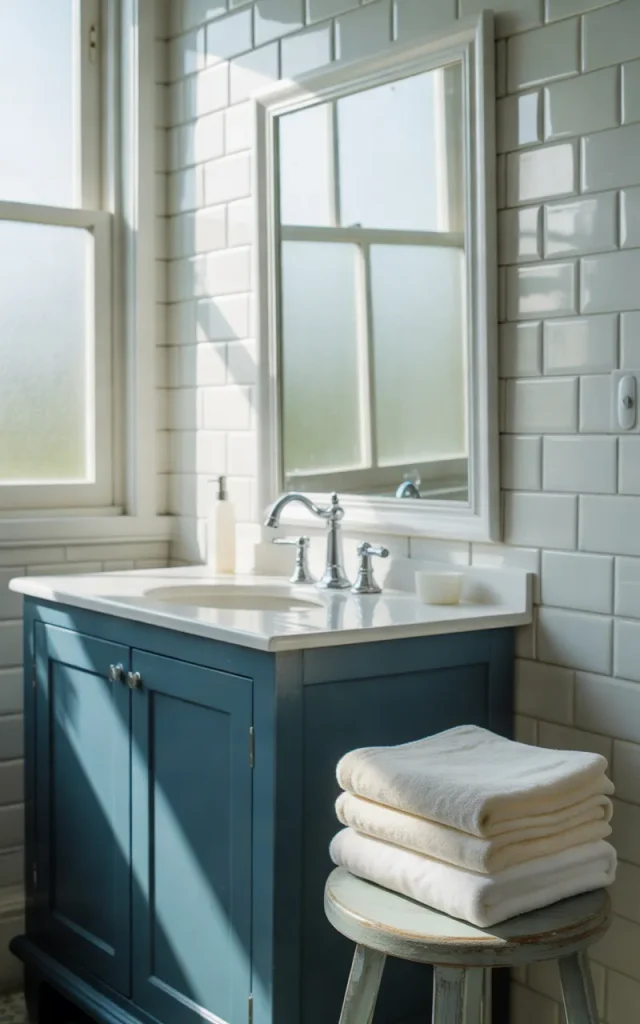
Navy blue and white are a wonderful choice if you want something traditional, crisp, and easy to update. Unlike brighter blues, navy brings a little richness to the bathroom without making the space feel overly playful.
I’d consider a navy vanity with a white quartz countertop, white wall tiles, and polished chrome taps. Alternatively, navy shower tiles can create a striking focal point while white walls keep the room balanced.
You don’t need seashell decorations or obvious nautical accessories to make this combination work. In fact, I think it looks better when the coastal influence is subtle. Add a pale wood stool, soft white towels, and a simple mirror.
One rule to remember:

Let navy provide the contrast, and use white to give the eye somewhere to rest.
Bring Terracotta and Sand Together for an Earthy Bathroom
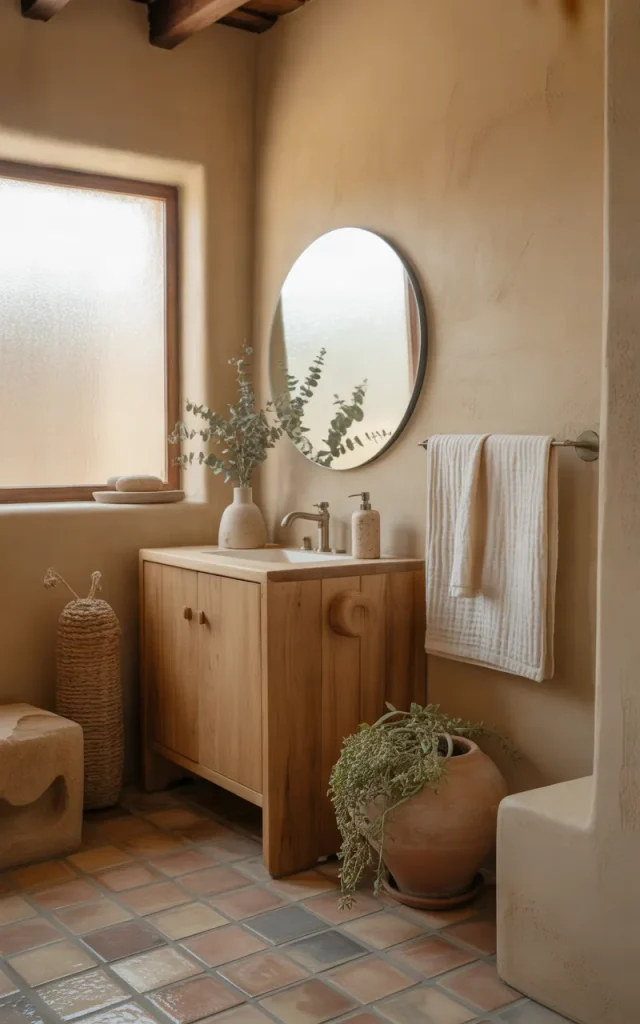
Terracotta and sand create a warm, sun-baked look that feels inviting from the moment you walk in. If you love earthy interiors, this combination offers plenty of character without relying on bright or flashy colors.
Imagine muted terracotta floor tiles, sandy beige walls, and a vanity made from natural oak. The colors feel connected because they share warm undertones. Even a small terracotta accent wall can give a plain bathroom much more personality.
I’d keep the remaining finishes simple. Cream towels, stone accessories, and warm white lighting complement the palette beautifully.
Budget Alternatives:
- Replace expensive terracotta tiles with terracotta-colored paint on a suitable dry wall.
- Use beige bath mats and towels to introduce the sandy tones.
- Add a small ceramic soap dish in a rusty orange shade.
You can capture the same earthy feeling without renovating the entire room.
Create a Luxurious Look With Black and Brushed Brass
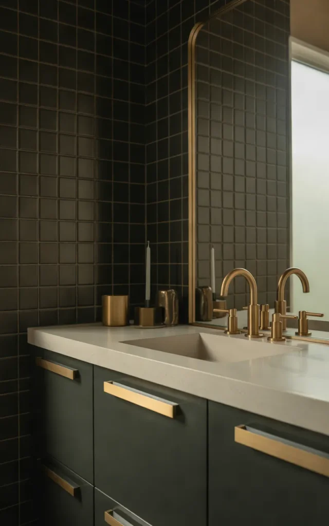
If you enjoy dramatic interiors, black and brushed brass deserve a place on your list. This pairing feels rich, polished, and a little glamorous, especially when the finishes are carefully balanced.
I’d use matte black tiles or a black vanity as the main feature, then introduce brushed brass through the taps, cabinet handles, mirror frame, and lighting. A pale countertop can prevent the room from feeling too dark.
The secret is restraint. Brass looks most effective when it appears in a few intentional places rather than covering every available surface. Similarly, black doesn’t have to dominate the entire room to make an impact.
Upgrade for under ₹2,000:
Consider replacing basic cabinet handles with brushed brass-style hardware, provided the new handles fit the existing holes. It’s a small change that can make an older vanity look more considered.
Combine Blush Pink and White for a Soft, Contemporary Finish
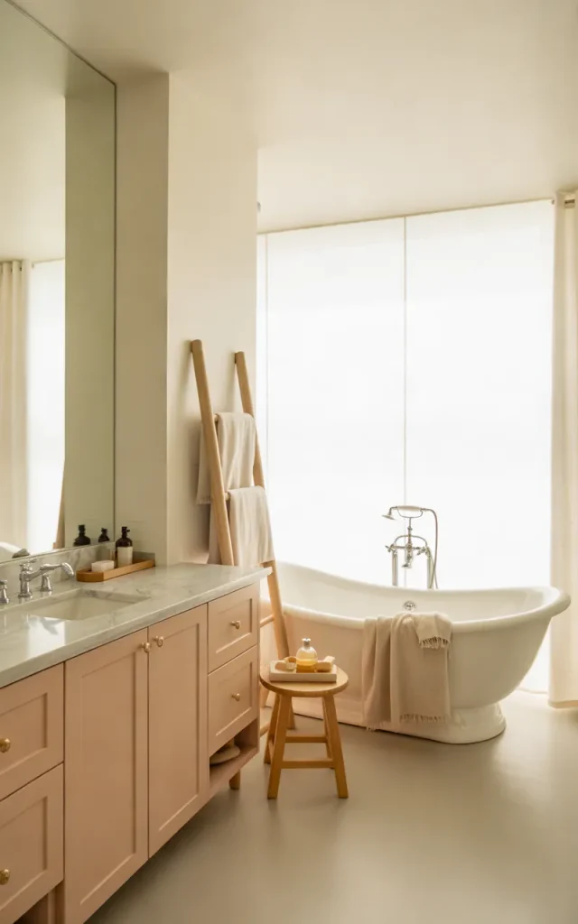
Blush pink doesn’t have to make a bathroom look overly sweet. When you choose a muted, dusty shade and pair it with white, the result can feel modern, elegant, and surprisingly grown-up.
I’d use blush pink on the vanity, a small feature wall, or the wall behind a freestanding bathtub. Keep the main fixtures white and introduce pale stone or light wood to add balance.
For a more polished finish, consider brushed nickel or champagne-toned hardware. If you prefer a simpler look, white accessories and clear glass will let the pink stand out gently.
A Quick Hack:
If you’re unsure about painting an entire wall, start with blush towels, a bath mat, and a small accessory tray. You can experiment with the color before committing to a permanent change.
Match Olive Green With Warm Wood for a Nature-Inspired Bathroom
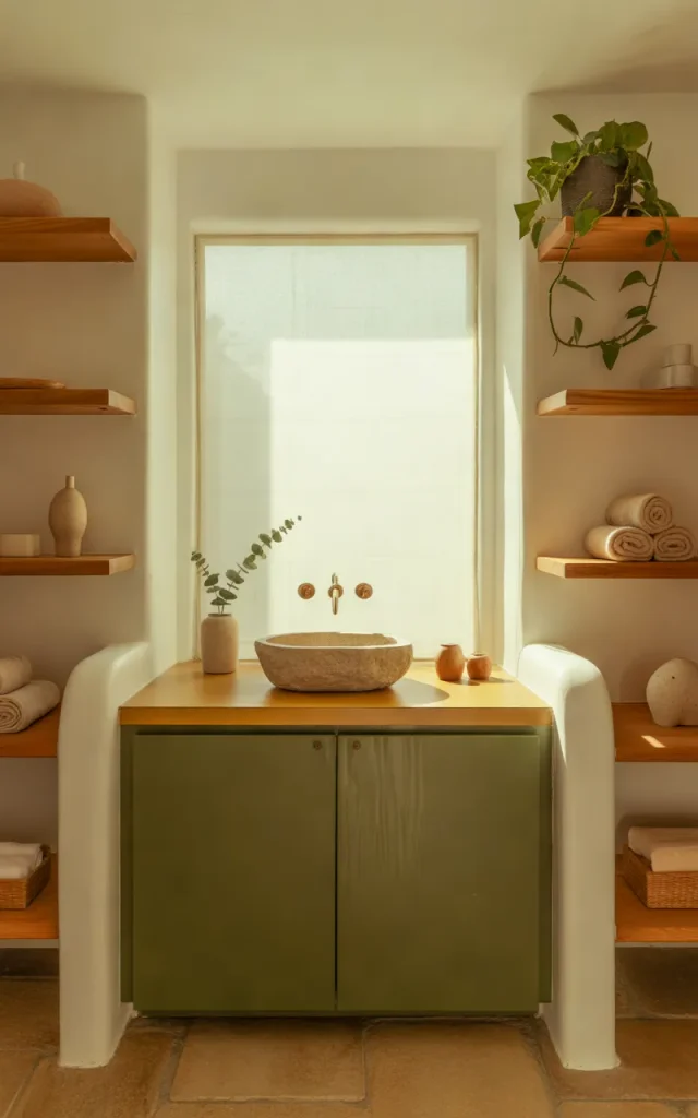
Olive green has more depth than sage, making it a lovely option when you want an earthy bathroom with a little more character. Paired with warm wood, it creates an atmosphere that feels grounded and natural.
I’d use olive green cabinetry with a wooden vanity top or introduce the color through tiles behind the sink. Oak, teak, and walnut-inspired finishes can all work, depending on whether you want the overall look to feel light or dramatic.
Cream-colored walls help soften the darker green. You can also introduce stone accessories and simple greenery, provided the plants suit your bathroom’s available light and humidity.
Why designers do this:

Green and wood naturally complement each other visually. The combination adds warmth and texture without requiring lots of decorative objects.
Use Sandstone Beige and Matte Black for a Minimalist Bathroom
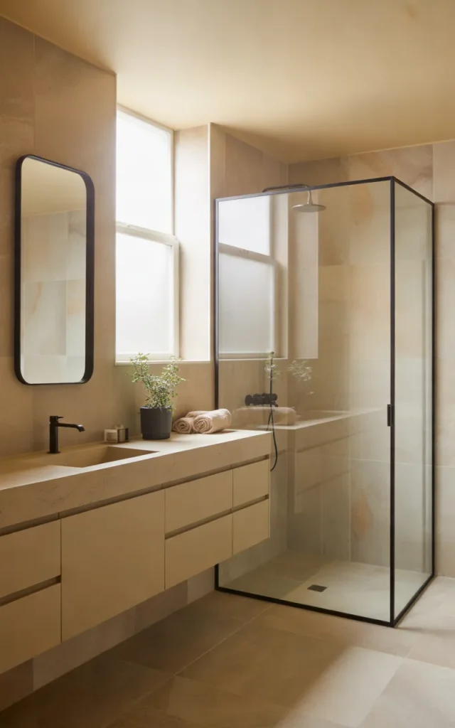
Sandstone beige and matte black strike a lovely balance between warmth and modern simplicity. This combination is especially useful if you like neutral interiors but don’t want your bathroom to look completely white.
I’d start with beige stone-look tiles, a matching vanity, and matte black taps. Black-framed shower screens or mirrors can repeat the darker tone and make the room feel visually connected.
Unlike a black-and-white scheme, this palette feels softer because beige introduces warmth. It’s a practical choice for both compact bathrooms and larger spaces with walk-in showers.
Pro-tip:

Choose beige tiles with subtle variation rather than a completely flat color. Gentle movement in the surface adds interest while keeping the overall design understated.
Embrace Forest Green and Marble for an Elegant Bathroom
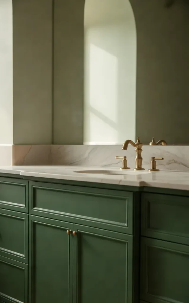
Forest green brings depth and richness to a bathroom, while marble-look surfaces add brightness and visual movement. Together, they create a sophisticated palette that feels luxurious without requiring elaborate decoration.
I’d consider deep green cabinetry beneath a white countertop with delicate gray veining. Another option is to use forest green tiles behind the vanity and keep the surrounding walls light. Either approach gives the room a strong focal point.
For the finishing touches, brushed brass works beautifully with forest green, while polished chrome gives the combination a cooler, more contemporary feel. Pale flooring can help maintain a sense of openness.
Style match guide:
| If you prefer… | Try this combination |
| Classic luxury | Forest green, white marble, brass |
| Modern minimalism | Forest green, gray stone, chrome |
| Natural warmth | Forest green, cream, oak |
I’d choose just one dominant green surface first. You can always add more if the room feels too restrained.
Pair Lavender and Warm White for a Subtle Color Statement
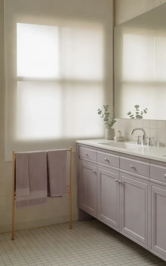
Lavender is often overlooked in bathroom design, but I think it deserves more attention. A muted lavender shade can introduce color without overwhelming the space, especially when it’s balanced with warm white and pale gray.
Try lavender cabinetry, white walls, and light gray flooring. If you’re decorating a rental or don’t want to repaint, use lavender towels, a bath mat, and small accessories instead.
The key is choosing a soft, slightly dusty lavender rather than an intense purple. The former feels gentle and contemporary, while the latter can dominate a small room quickly.
Common mistakes to avoid:
- Choosing a purple shade that clashes with existing cool-gray tiles.
- Using too many different pastel colors at once.
- Ignoring lighting, which can make lavender appear more blue or pink.
A little lavender goes a long way. Keep the surrounding finishes simple and let the color do its work.
Contrast Chocolate Brown With Cream for a Warm, Upscale Look
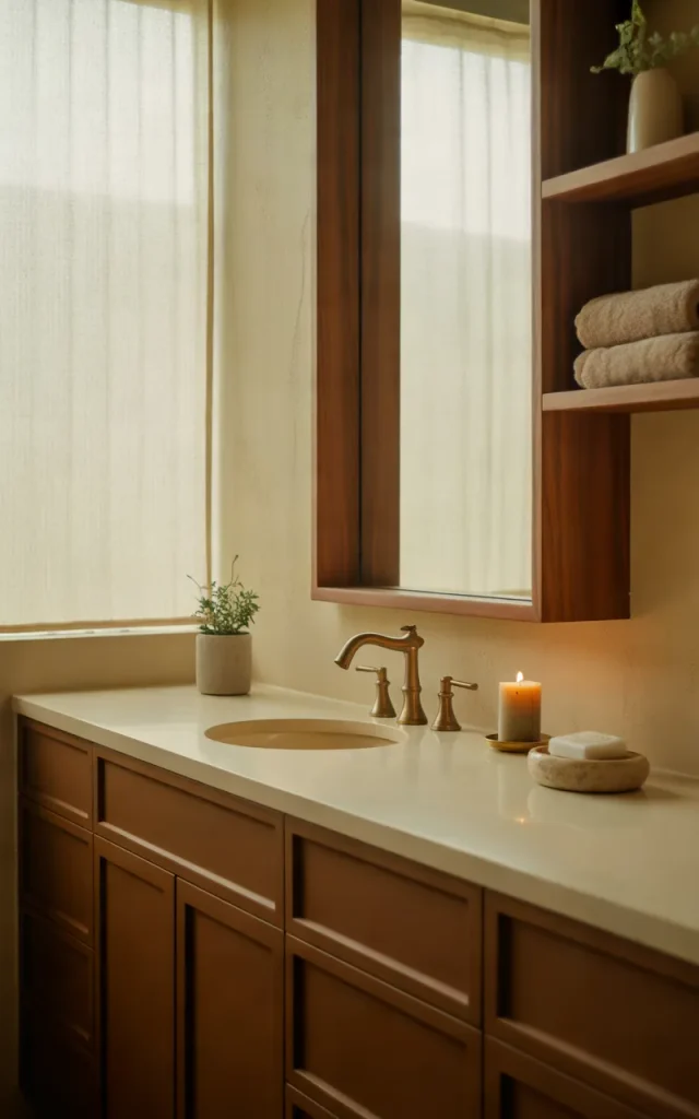
Chocolate brown is a wonderful alternative to black when you want depth without a stark contrast. Paired with cream, it creates a warm and sophisticated bathroom that feels comfortable rather than severe.
I’d use dark brown cabinetry, cream walls, and a pale countertop. Wood-look tiles or walnut-inspired accessories can reinforce the warmth, while simple brass or bronze hardware introduces a subtle decorative touch.
This palette works especially well when the brown has a rich, chocolate undertone rather than an overly red finish. Keep the surrounding surfaces light so the darker elements remain defined.
A Micro-tip:

If you're choosing paint, compare the brown beside your actual tiles and countertop. Brown can shift dramatically under warm artificial lighting, so test a sample before covering a large area.
Refresh the Bathroom With Sky Blue and Bright White
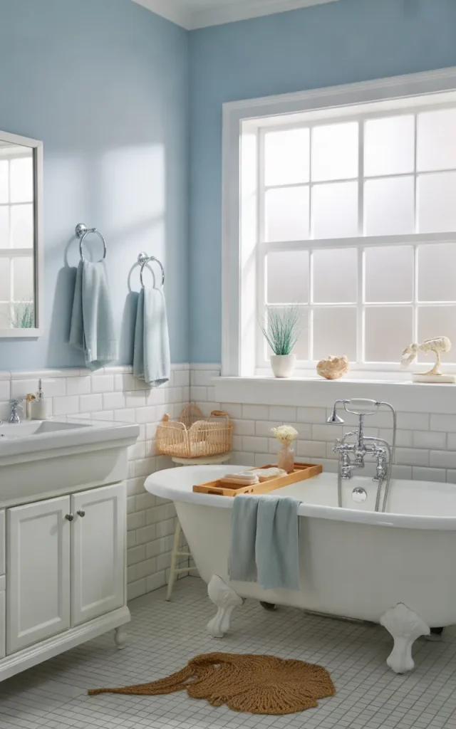
Sky blue and bright white create a clean, airy atmosphere that feels particularly lovely in bathrooms with good natural light. The combination is fresh without being overly bold, and it can make everyday spaces feel more cheerful.
I’d use sky blue on the walls or vanity and keep the shower tiles, countertop, and fixtures white. Chrome hardware works naturally with this palette, while pale wood introduces warmth if the room starts feeling too cool.
You can also bring the blue in through smaller details. A painted cabinet, blue bath mat, or matching hand towels may be enough to refresh an otherwise neutral bathroom.
Works best in:
Family bathrooms, guest bathrooms, and spaces where you want a light, cheerful appearance.
To keep the result from looking too plain, vary the textures. Glossy white tiles, matte blue paint, and soft cotton towels create interest even when the color palette is simple.
Mix Rust Orange and Warm Gray for an Unexpected Combination
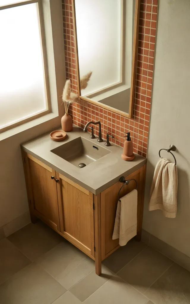
Rust orange brings energy and warmth to a bathroom, while warm gray keeps the overall look grounded. It’s a less predictable combination than blue and white, which makes it appealing if you want something a little different.
I’d use rust-colored tiles as a shower feature or introduce the shade through a painted vanity. Warm gray flooring and neutral walls help prevent the orange from becoming overwhelming.
For accessories, choose cream towels, dark bronze hardware, or natural wood. These materials complement the earthy undertones and give the bathroom a cohesive finish.
Colour swap suggestion:
| Original color | Alternative |
| Rust orange | Muted terracotta |
| Warm gray | Greige |
| Dark bronze | Matte black |
The palette can lean rustic or contemporary depending on the materials you select. Smooth cabinetry creates a modern finish, while textured tiles and wood make it feel more organic.
Combine Pale Yellow and White for a Cheerful Bathroom
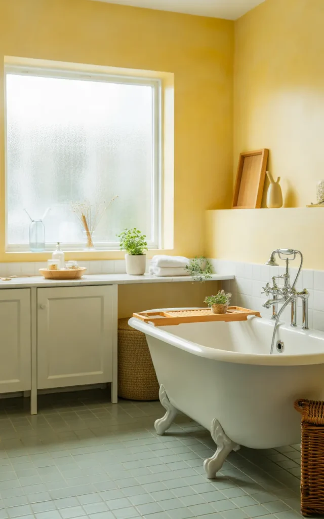
Pale yellow can brighten a bathroom without the intensity of a strong golden shade. When paired with white, it creates a welcoming look that feels sunny and relaxed.
I’d choose a soft buttery yellow for the walls and keep the vanity, bathtub, and countertop white. If you’re hesitant about using yellow on every wall, try it behind the vanity or on a single section of wall instead.
Warm wood accessories and simple chrome fixtures complement the palette without competing with it. A pale yellow bathroom can also work beautifully with light gray flooring, especially if the gray has warm undertones.
Instant Gratification Tip:
Add two or three pale yellow towels to an otherwise white bathroom. It’s a quick way to see whether you enjoy the color before making a larger change.
Go Bold With Burgundy and Soft Beige
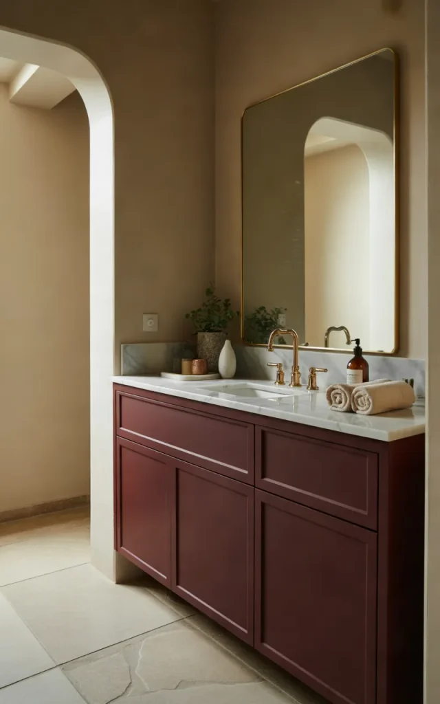
Burgundy is a rich, dramatic color that can make a bathroom feel distinctive and luxurious. Because it’s deep and saturated, I prefer using it strategically rather than covering every wall with it.
Consider burgundy cabinetry against soft beige walls, or introduce burgundy tiles behind a white vanity. Beige softens the overall appearance, while white fixtures provide a little extra brightness.
For the hardware, brushed brass or champagne-toned finishes can complement burgundy beautifully. If you prefer a less traditional look, matte black creates a sharper contrast.
Trend callout:
Deep, wine-inspired shades can work especially well in bathrooms where you want a jewel-toned accent rather than a conventional neutral scheme.
Balance Pale Green and Stone Gray for a Natural Spa Feel
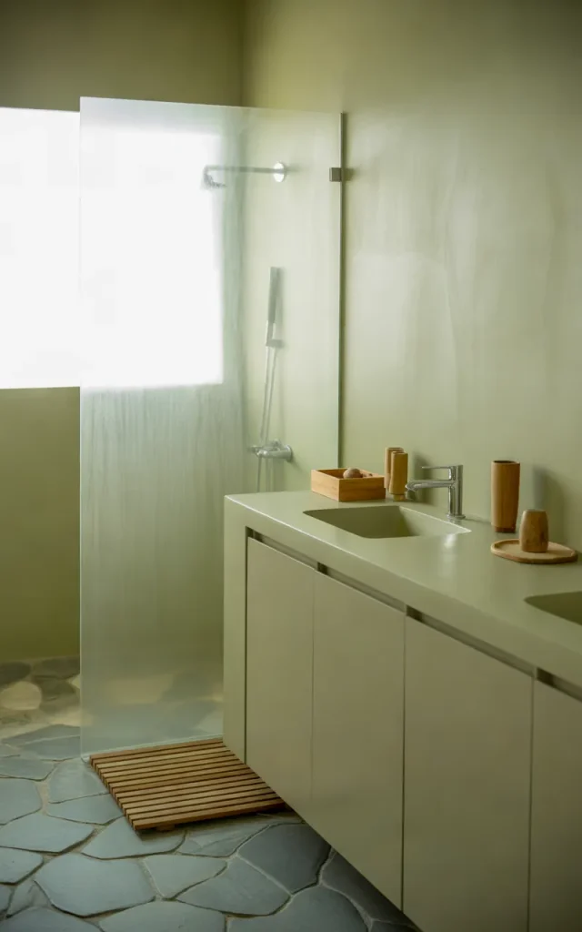
Pale green and stone gray offer a quieter alternative to stronger green palettes. The combination feels fresh and understated, especially when the gray resembles natural limestone or concrete.
I’d use pale green walls or cabinetry alongside gray floor tiles and a white countertop. Clear glass shower screens and minimal hardware help maintain the calm, uncluttered look.
This palette is particularly useful if you want a bathroom that feels relaxing but not overly warm or cool. Pale green adds a hint of nature, while gray keeps the design grounded.
Small space hack:

Keep the green on the upper walls or vanity and choose a lighter gray for the floor. This creates a gentle separation between surfaces without introducing too many contrasting colors.
Elevate the Bathroom With Midnight Blue and Warm Ivory
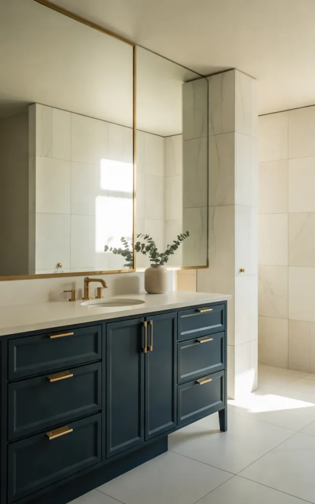
Midnight blue is a deeper, moodier alternative to navy. Paired with warm ivory, it creates a bathroom that feels elegant and atmospheric without relying on the starkness of pure white.
I’d use midnight blue on the vanity, lower wall panels, or a feature wall behind the bathtub. Warm ivory can brighten the remaining surfaces and keep the darker shade from dominating the entire room.
This palette becomes especially interesting when you introduce subtle texture. Think ivory stone-look tiles, a midnight blue cabinet with a matte finish, and simple brass or brushed nickel hardware. Each material adds something different while the colors remain controlled.
My design approach:
I would choose one major midnight blue surface first, then repeat the shade in a smaller detail such as a hand towel or accessory. That repetition helps the design feel connected.
If the bathroom has little natural light, consider using blue on the vanity rather than every wall. A lighter ceiling and reflective surfaces can help the space feel more comfortable.
Combine Slate Blue and Natural Oak for Modern Warmth
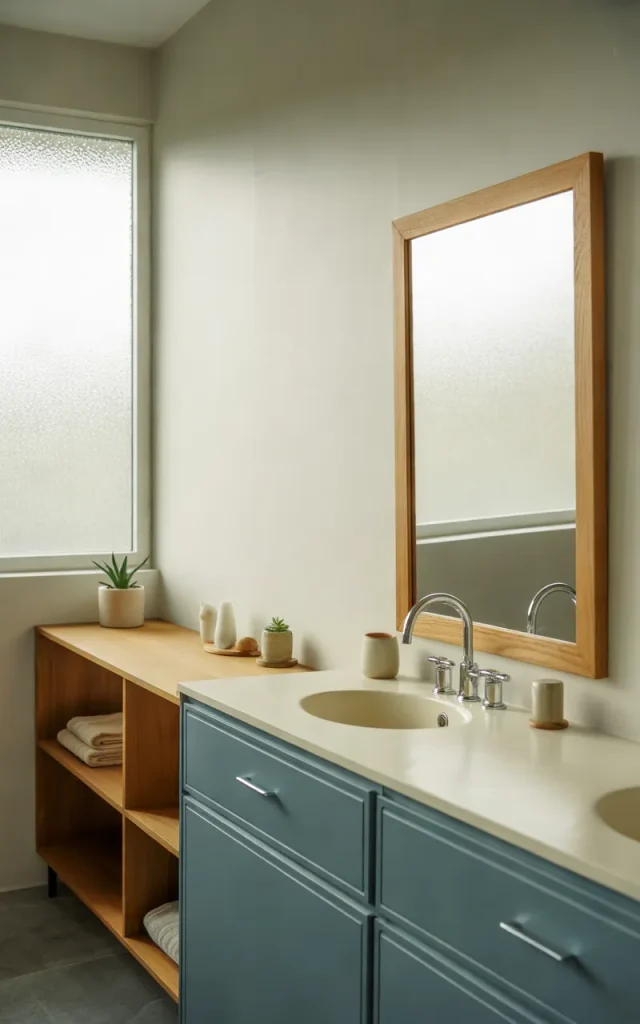
Slate blue has a muted, slightly gray quality that makes it easier to coordinate than many brighter blues. When paired with natural oak, it creates a bathroom that feels contemporary but still welcoming.
I’d consider a slate blue vanity with an oak-framed mirror or wooden storage shelves. White walls and a pale countertop keep the room from feeling heavy, while gray stone-look flooring connects the blue and wood visually.
This palette is also a good option if you already have a wooden vanity and want to introduce a new color without replacing everything. Painting a suitable cabinet in slate blue can refresh the room while allowing the existing wood to remain part of the design.
Budget-friendly approach:
Focus on one change that will make the biggest difference. A vanity repaint or a new mirror frame may be more effective than buying lots of small accessories.
Refresh a Neutral Bathroom With Seafoam Green and White
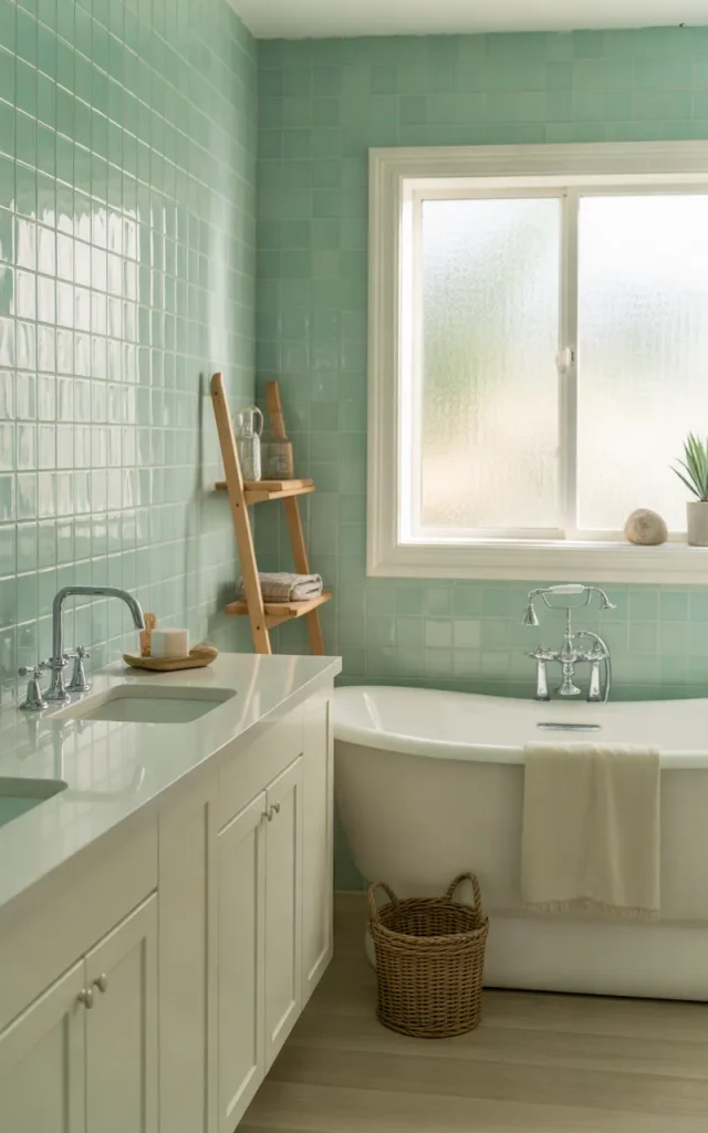
Seafoam green is lighter and brighter than sage, giving it a fresh appearance that works particularly well in bathrooms where you want a relaxed, almost coastal feeling.
I’d pair seafoam green walls or tiles with white cabinetry, a white countertop, and pale flooring. The combination works beautifully with chrome fixtures, although brushed nickel can create a softer finish.
One of the advantages of this palette is that it doesn’t require many additional colors. The green already provides a subtle point of interest, and white gives it enough breathing room to stand out.
Seasonal switch:
| For a fresh spring look | For a cozy winter look |
| White towels | Warm ivory towels |
| Pale green accessories | Sage accessories |
| Light wood details | Richer wood accents |
You can change the mood without repainting or replacing your tiles. Simply switching towels and accessories can make the bathroom feel slightly different throughout the year.
If your bathroom already has white fixtures, start with seafoam towels or a suitable painted cabinet. You’ll get a clear sense of the palette before making a more permanent change.
Match Soft Peach With Warm Gray for a Contemporary Bathroom
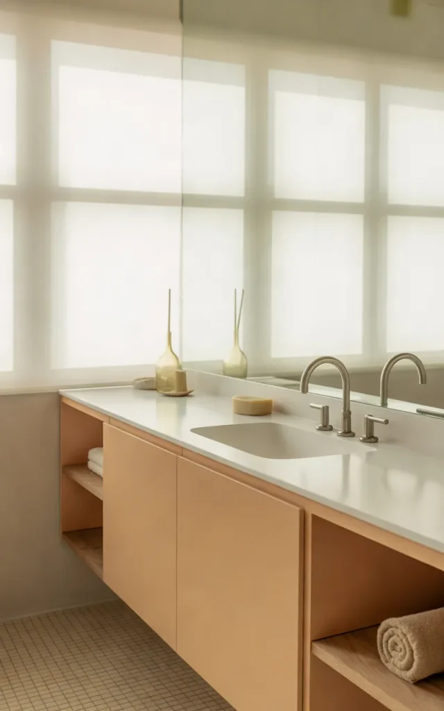
Soft peach is a lovely alternative to blush pink if you want a warmer, slightly sunnier color. Paired with warm gray, it creates a gentle contrast that feels modern without becoming too playful.
I’d use peach on the vanity or a feature wall and choose warm gray tiles for the floor. White fixtures help maintain brightness, while pale wood or brushed nickel adds a finishing touch.
The secret is choosing a muted peach rather than a vivid orange-pink. A dusty shade tends to coordinate more easily with gray and is less likely to dominate the room.
A Pro-tip:

Look at peach paint samples beside your actual flooring. Some shades have strong orange undertones, while others lean pink. That difference can change the whole feel of the bathroom.
Design a Sophisticated Bathroom With Black, White, and Natural Wood
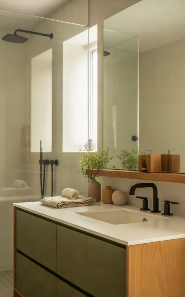
Black, white, and natural wood form a versatile three-color palette that can suit almost any contemporary bathroom. Black introduces contrast, white keeps the space bright, and wood adds the warmth that a strictly monochromatic scheme sometimes lacks.
I’d start with white walls and a white countertop, then introduce black through the vanity, mirror frame, or shower hardware. Natural wood can appear in open shelving, a stool, or a vanity detail.
The proportions matter. If black covers too much of a small bathroom, the room may feel darker than you’d like. Keeping white as the main background and using wood as a secondary accent creates a more balanced result.
Layer it like this:
- White walls and a pale countertop establish the base.
- Black hardware or cabinetry provides contrast.
- Natural wood adds warmth and texture.
- Neutral towels keep the palette from becoming cluttered.
This is also a practical choice if you enjoy changing your décor. You can swap wooden accessories for darker finishes or introduce colored towels without redesigning the permanent surfaces.
Combine Warm Gray, Cream, and Sage for a Balanced Bathroom
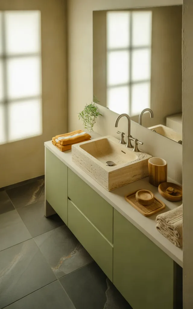
If you can’t decide between a neutral bathroom and one with a little color, this combination brings the two together beautifully. Warm gray provides a grounded foundation, cream softens the overall look, and sage adds just enough green to make the space feel fresh.
I’d use warm gray for the floor, cream for the main walls, and sage for the vanity or a smaller feature area. This arrangement allows each color to play a clear role instead of competing for attention.
The palette works particularly well when you want a bathroom that feels calm but not completely plain. You can introduce wood, stone, and textured fabrics without disrupting the color scheme. Brushed nickel gives the room a subtle modern finish, while brass adds warmth.
Checklist before you begin:
- Check whether your existing tiles have warm or cool undertones.
- Choose a sage shade that complements the gray rather than clashing with it.
- Keep the largest surfaces relatively light.
- Test paint samples under your bathroom’s actual lighting.
- Repeat each main color at least once so the design feels connected.
What I like most about this palette is its flexibility. You can make sage the main feature for a greener look or let cream and gray dominate for a quieter result.
Final Thoughts
Choosing the right bathroom color scheme doesn’t mean you need to renovate everything at once. Sometimes, repainting a vanity, changing the towels, or introducing a different accent color is enough to give the room a fresh new look.
I’d recommend starting with the colors already present in your bathroom, especially the tiles, countertop, and major fixtures. Choose a palette that complements those finishes, then experiment with smaller changes before investing in a complete makeover.
Whether you prefer earthy terracotta, dramatic charcoal, calming sage, or a timeless white-and-beige combination, the best bathroom color scheme is one that feels right for your home. Pick one idea that catches your eye and start small. You might be surprised by how much difference a thoughtful color change can make. 🛁
